what kind of noodles you ask?!

Role: Senior Visual Designer
Date: 2021-Present
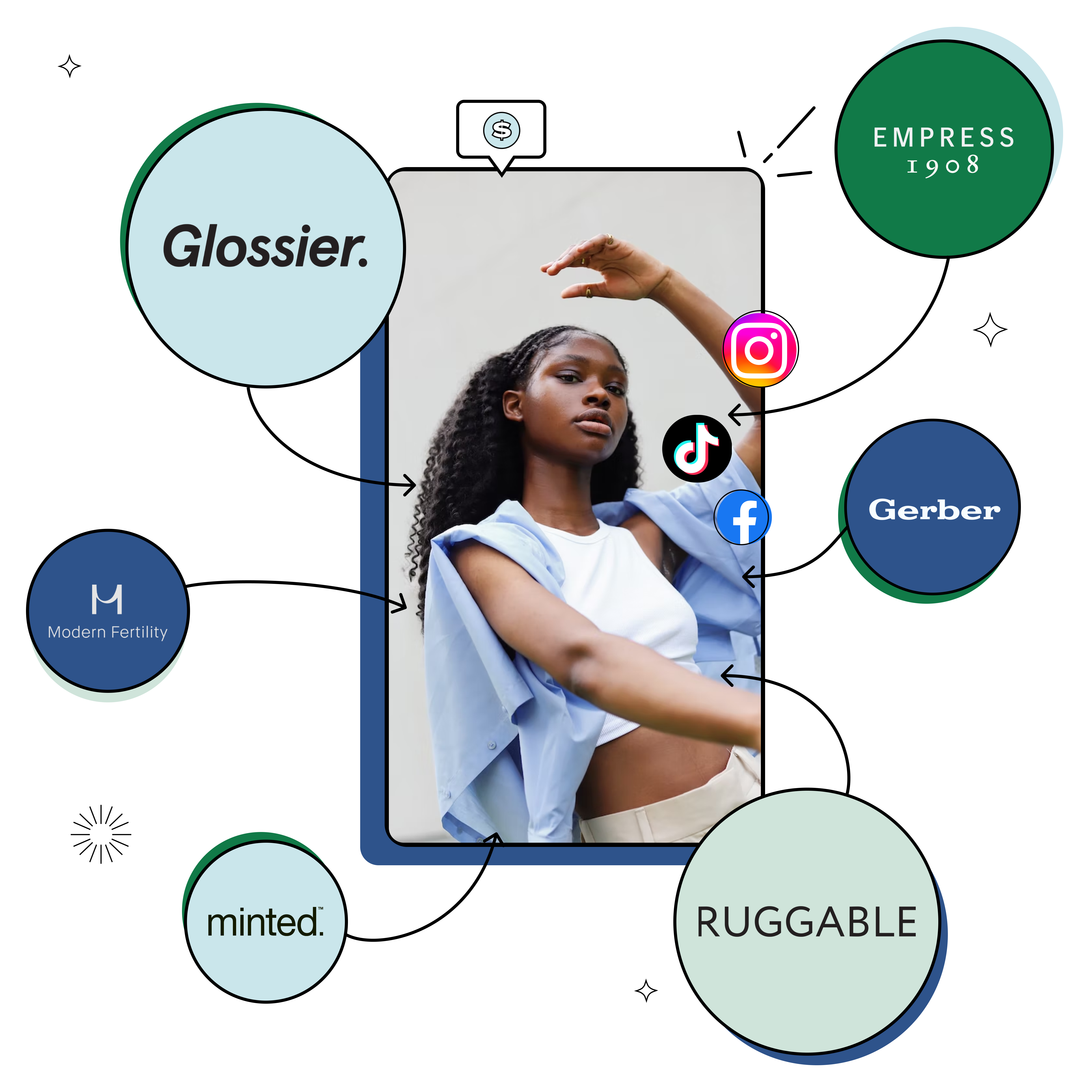
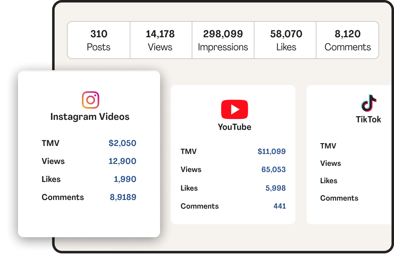
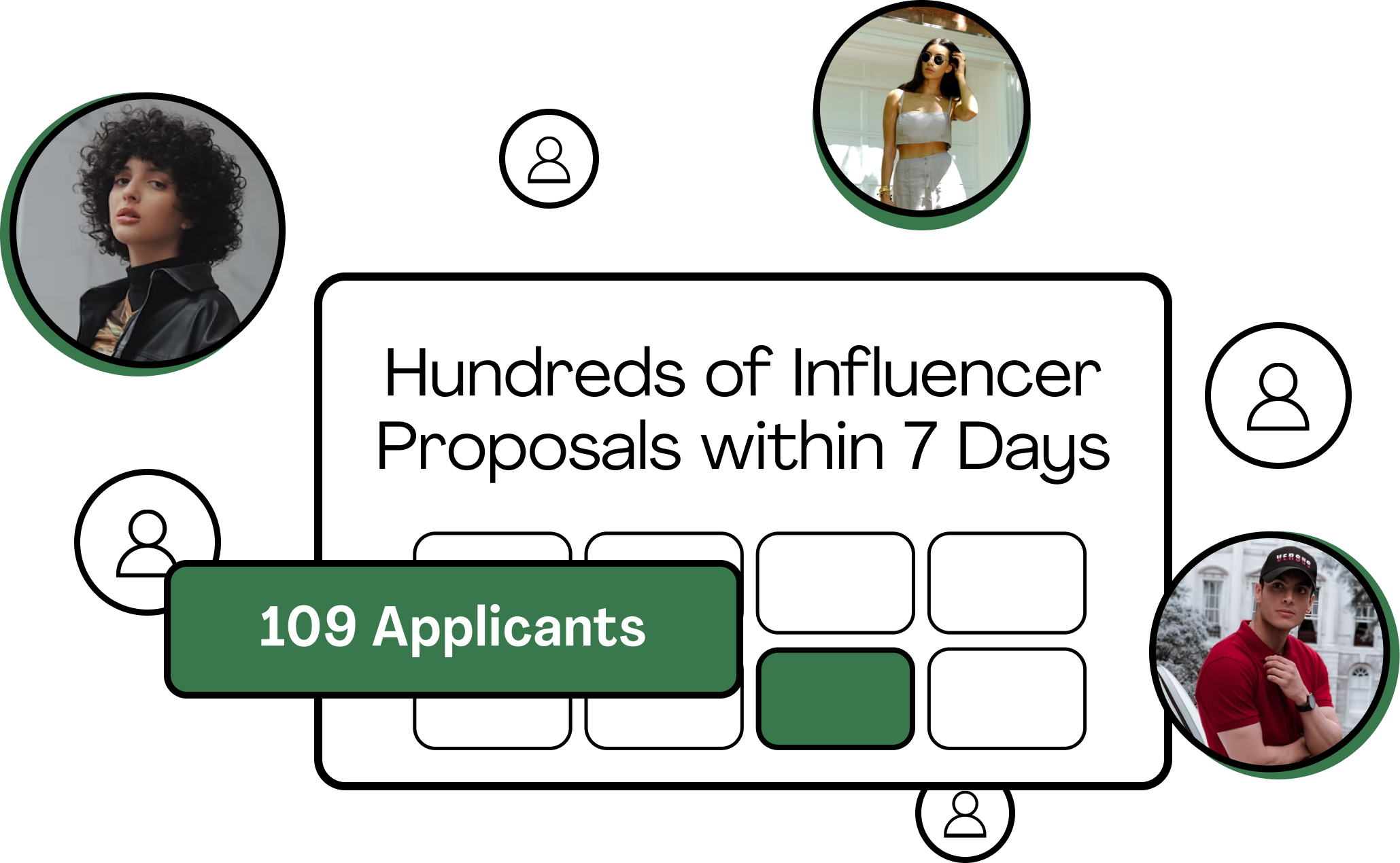
Description: Aspire is a B2B SAAS all-in-one influencer marketing platform that brands use to run creator campaigns at scale.
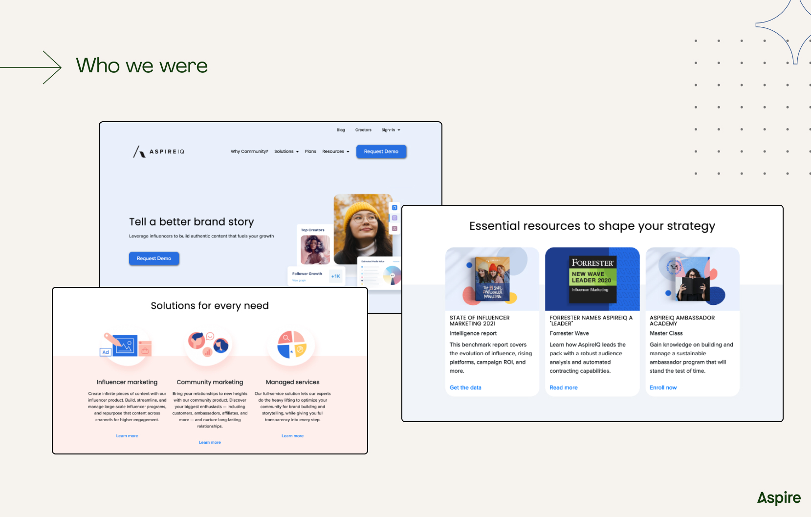
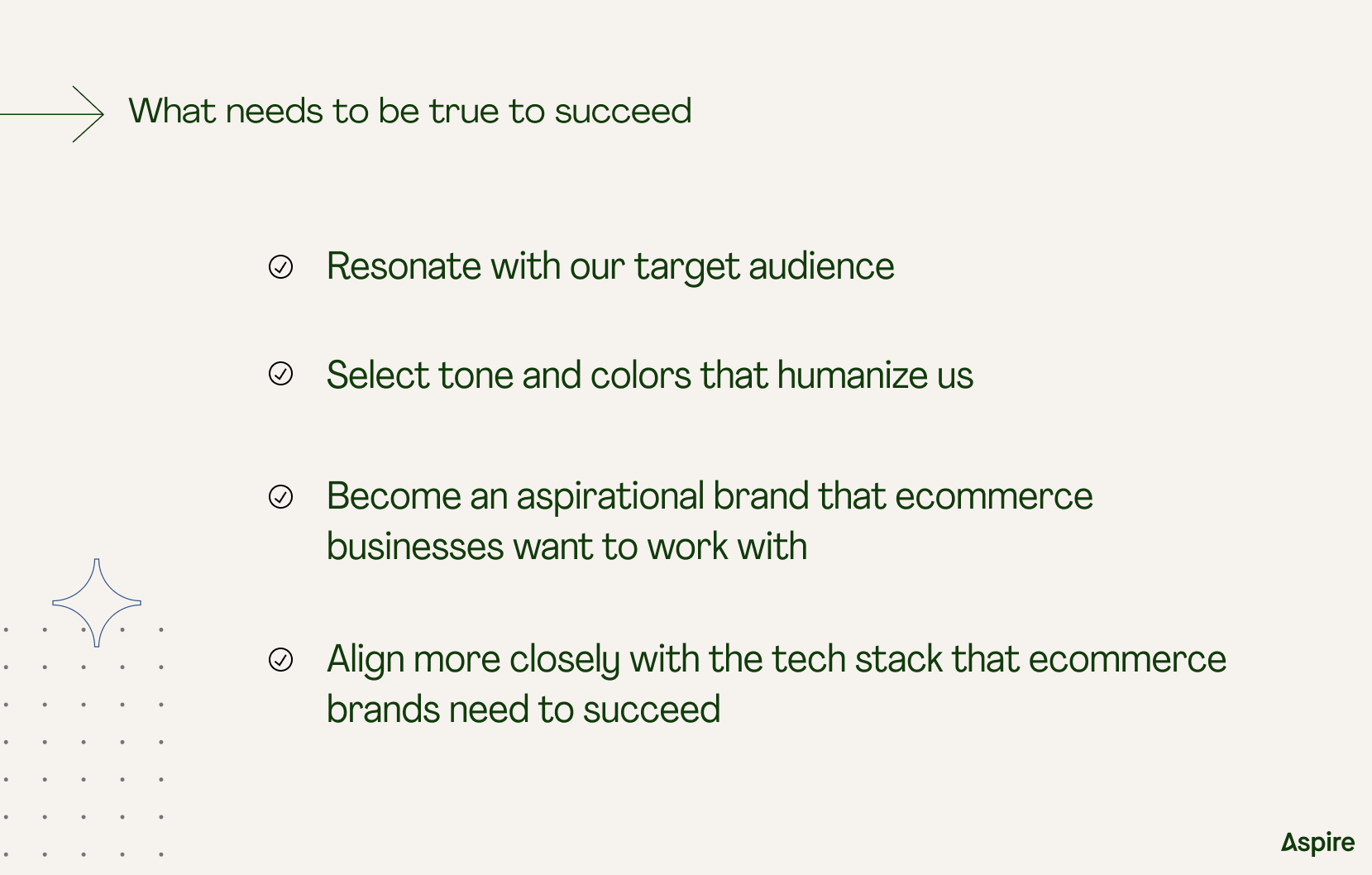
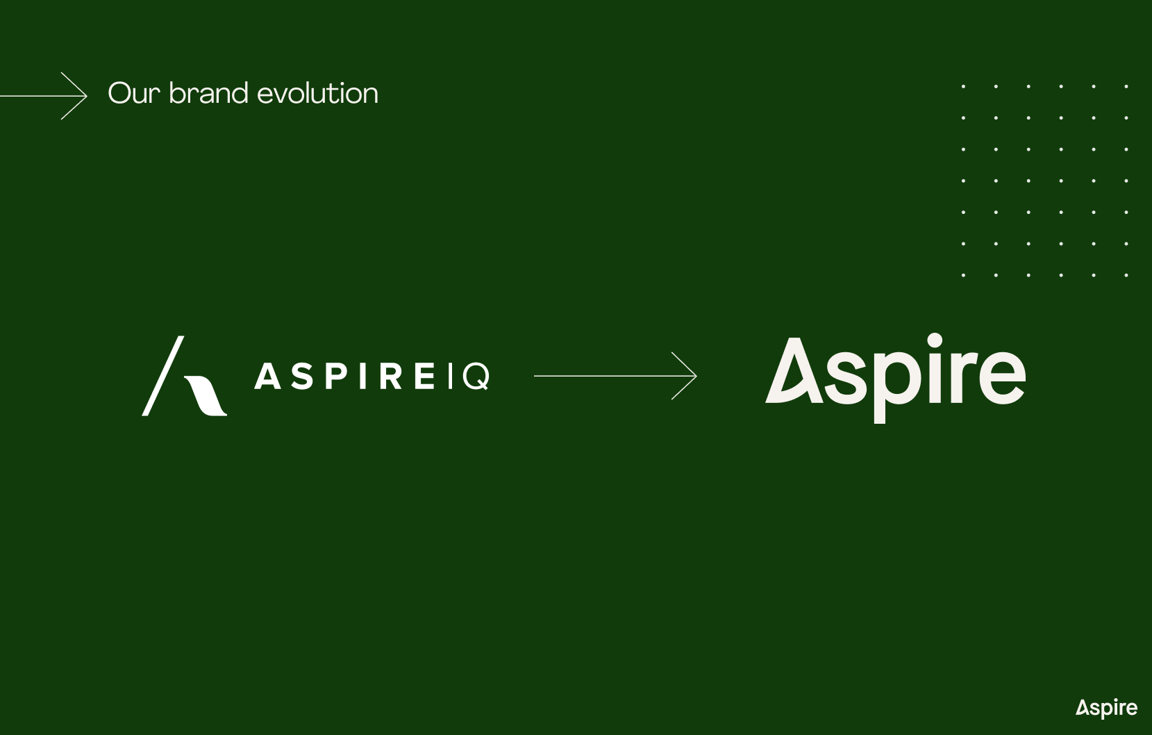
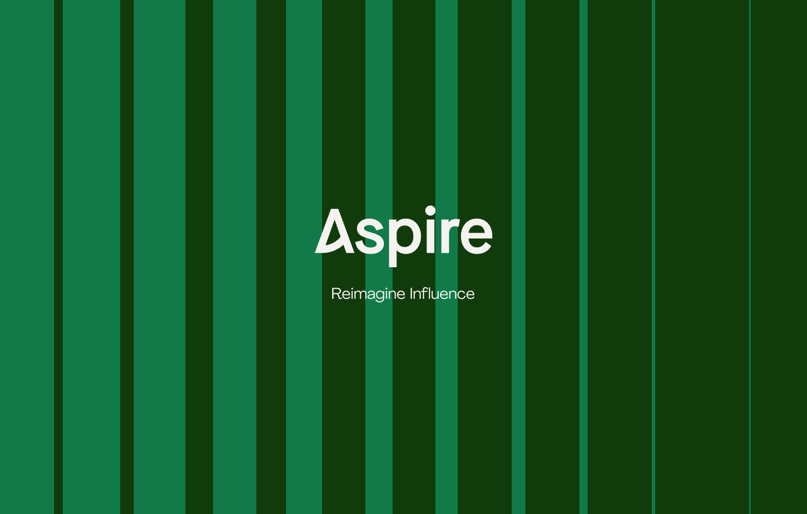
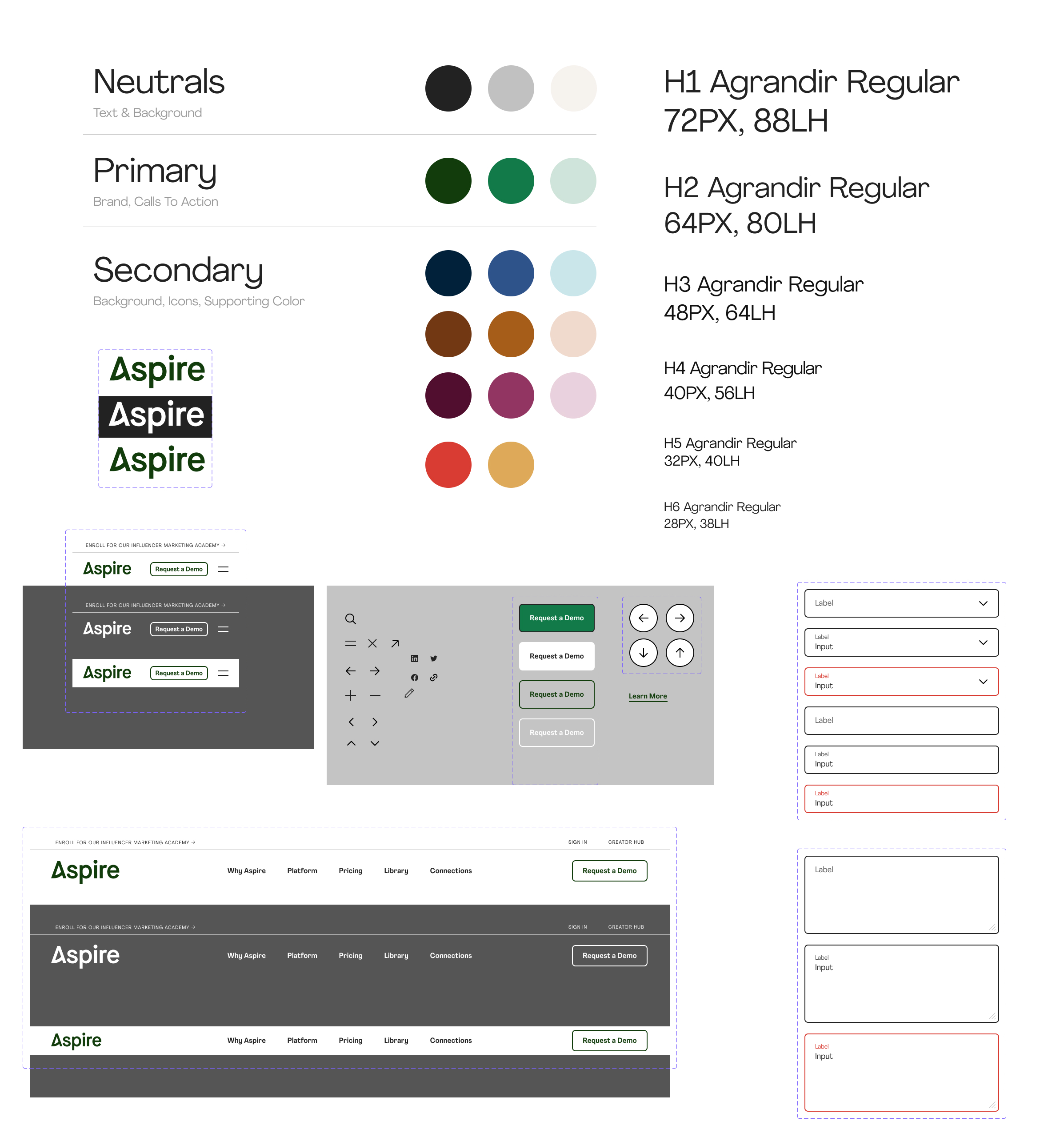
Rebrand
Led a full company rebrand, developing a comprehensive brand book, promotional campaigns, and visual guidelines while redesigning the entire website to establish a cohesive, modern identity.
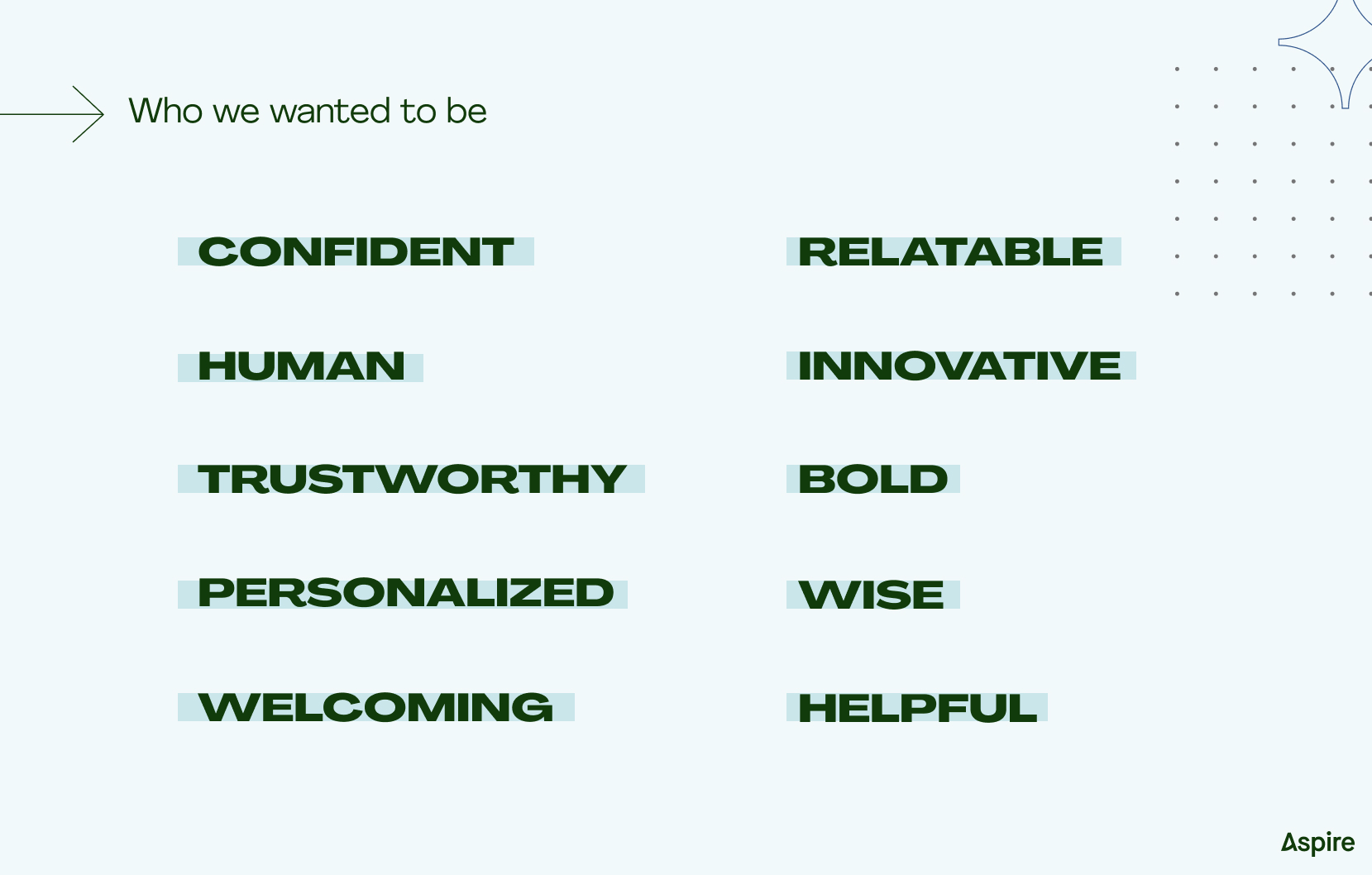
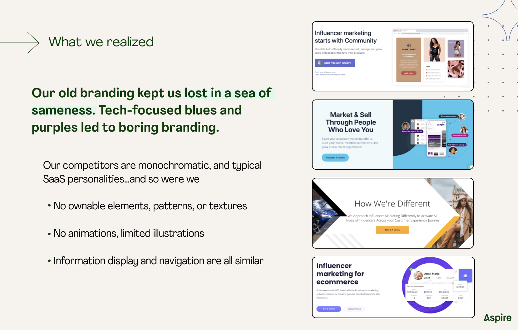
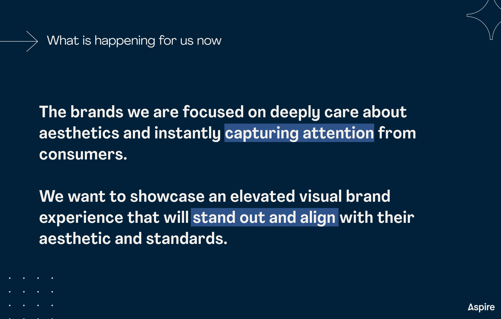
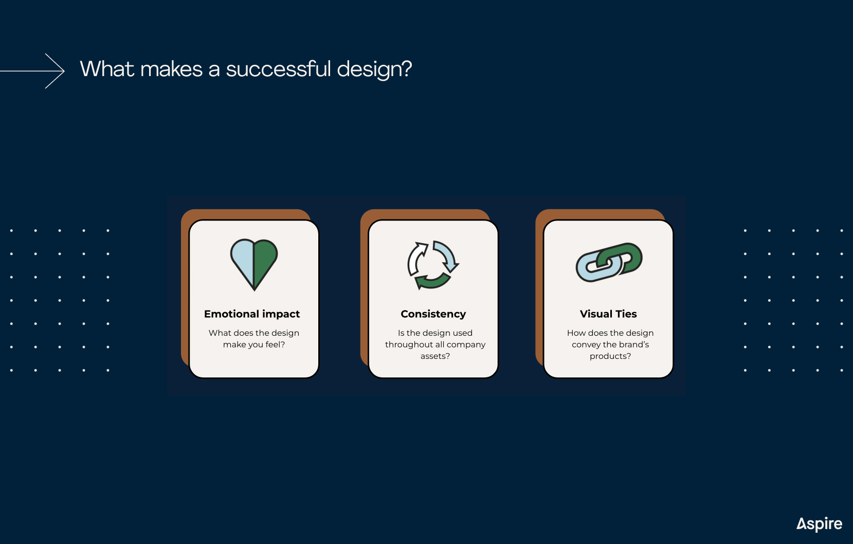
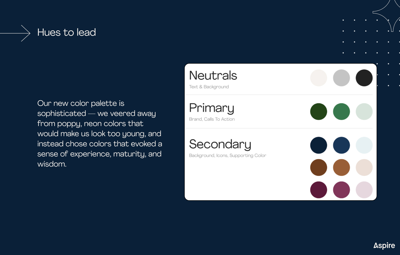
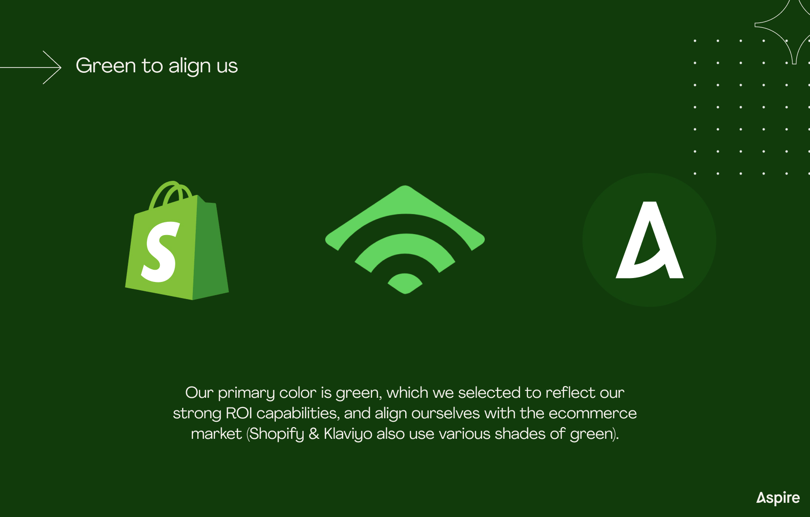
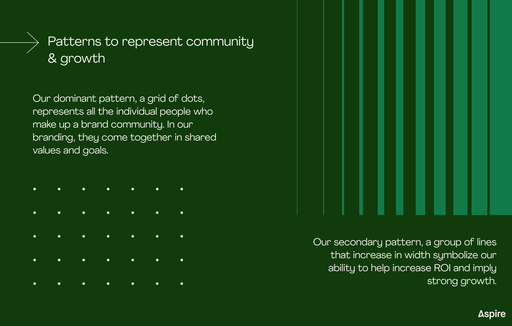
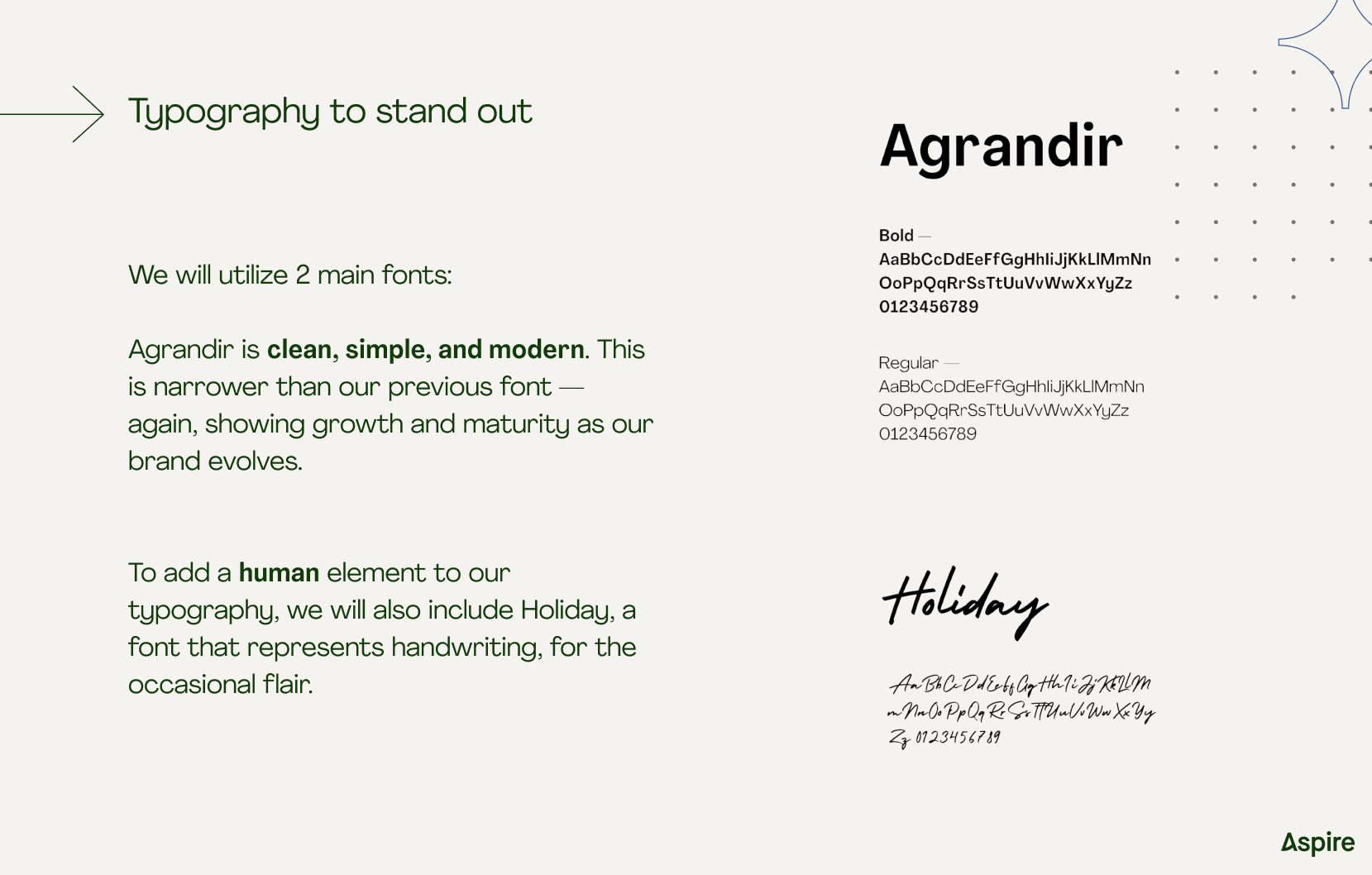
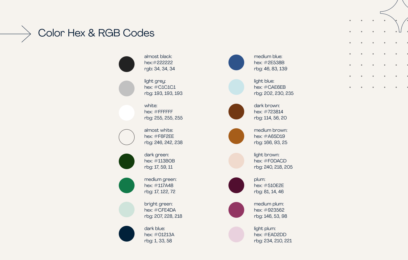
Snippets of the Brand Book:
Design System:
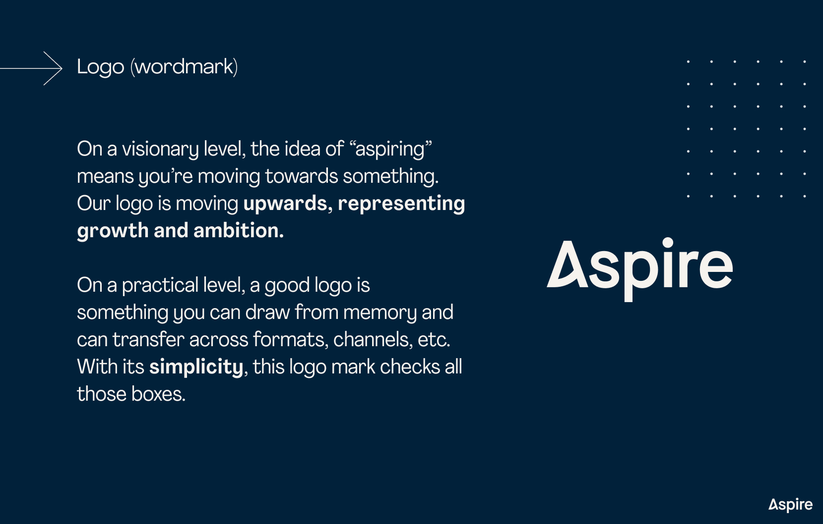
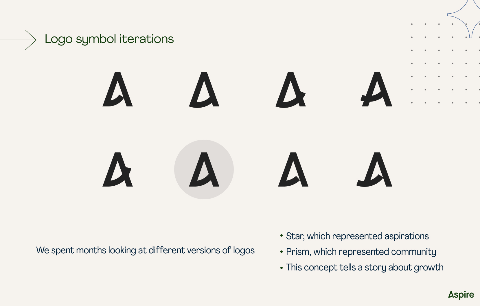
Logomark Development:
Final Logomark:
logo | lifestyle mockups
Site Design:
Representative page from the redesigned site
(brand case study):
One of the larger projects I worked on was the promotional video for Aspire’s new interface launch. I developed all visual assets and worked closely with the video editor throughout the process, contributing to the visual direction, pacing, and narrative flow of the final film.
Role: Senior Visual Designer
Date: 2020-2021
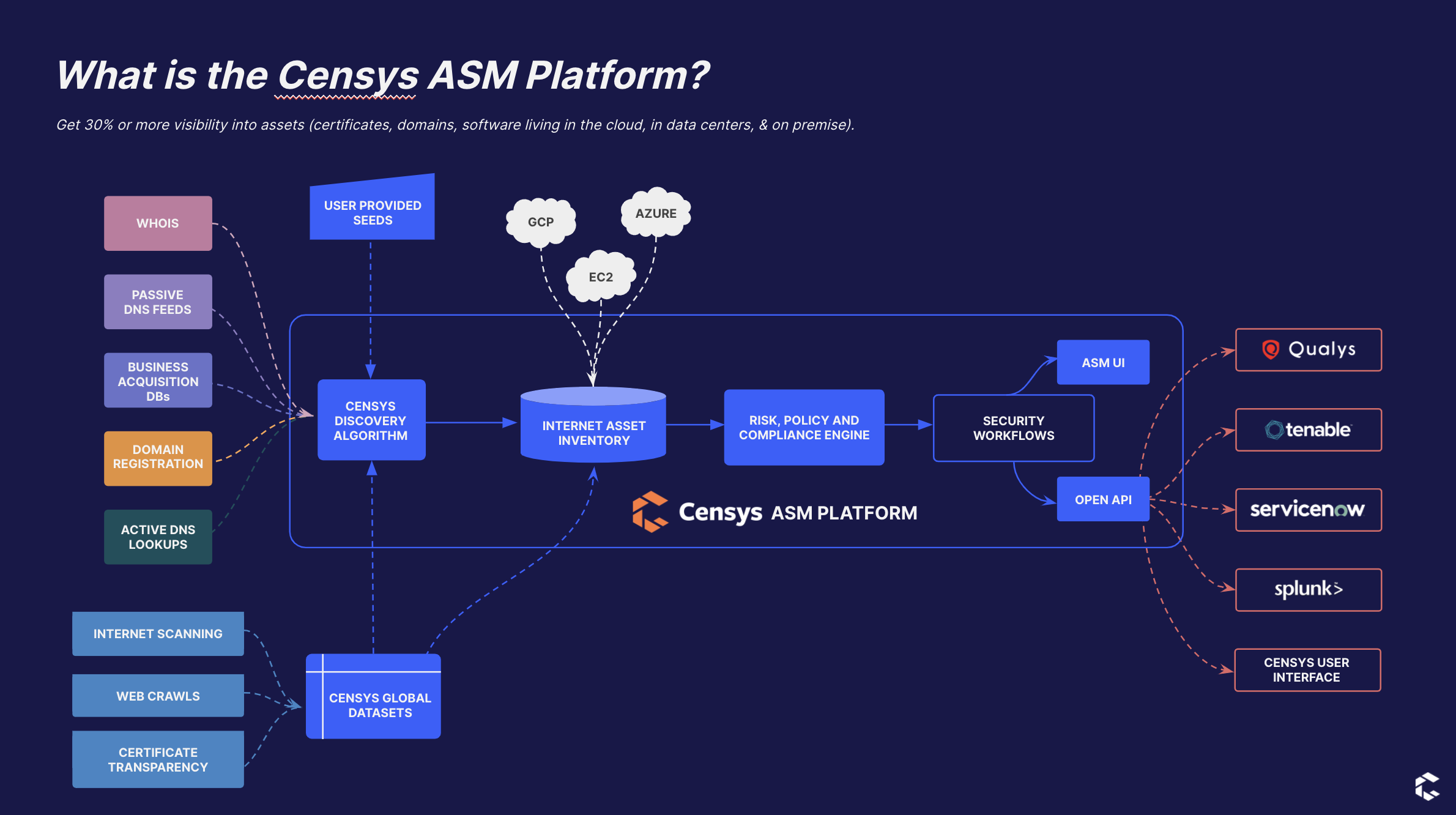
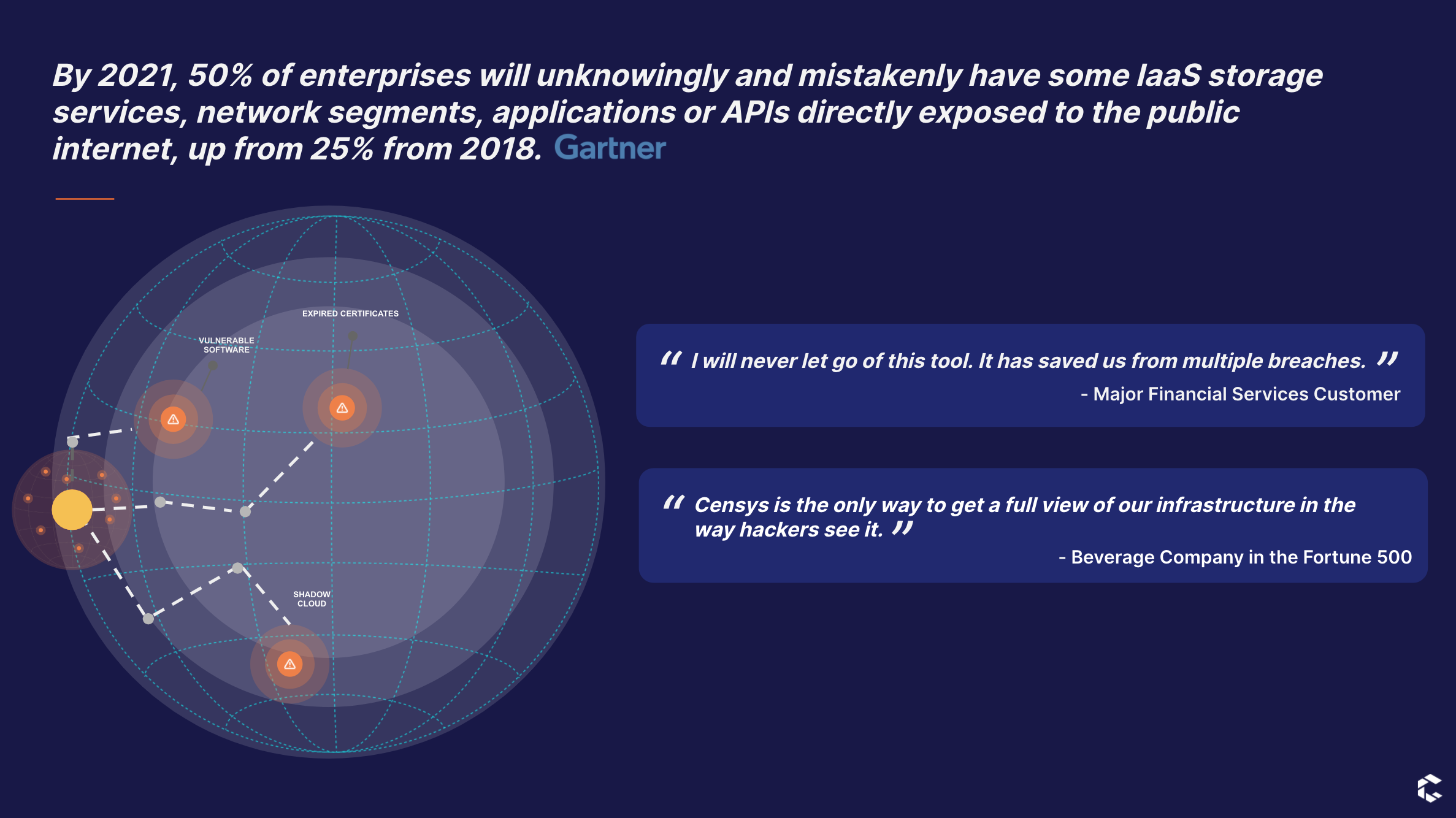
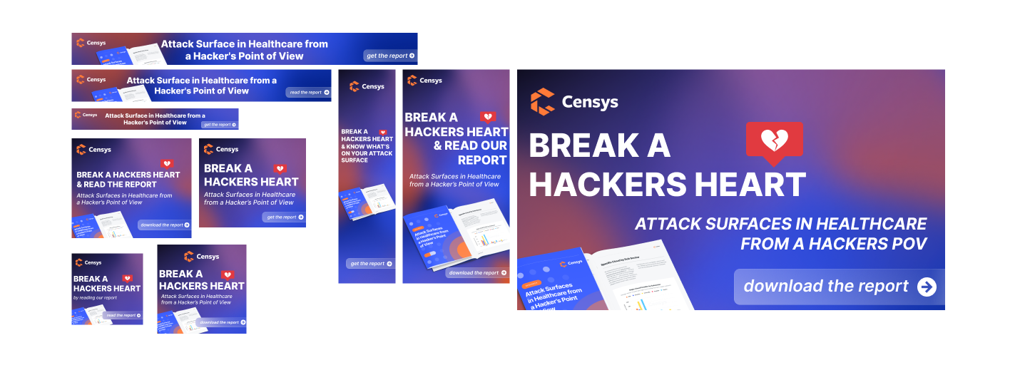
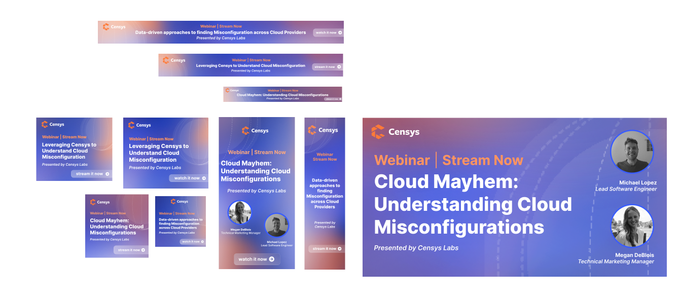
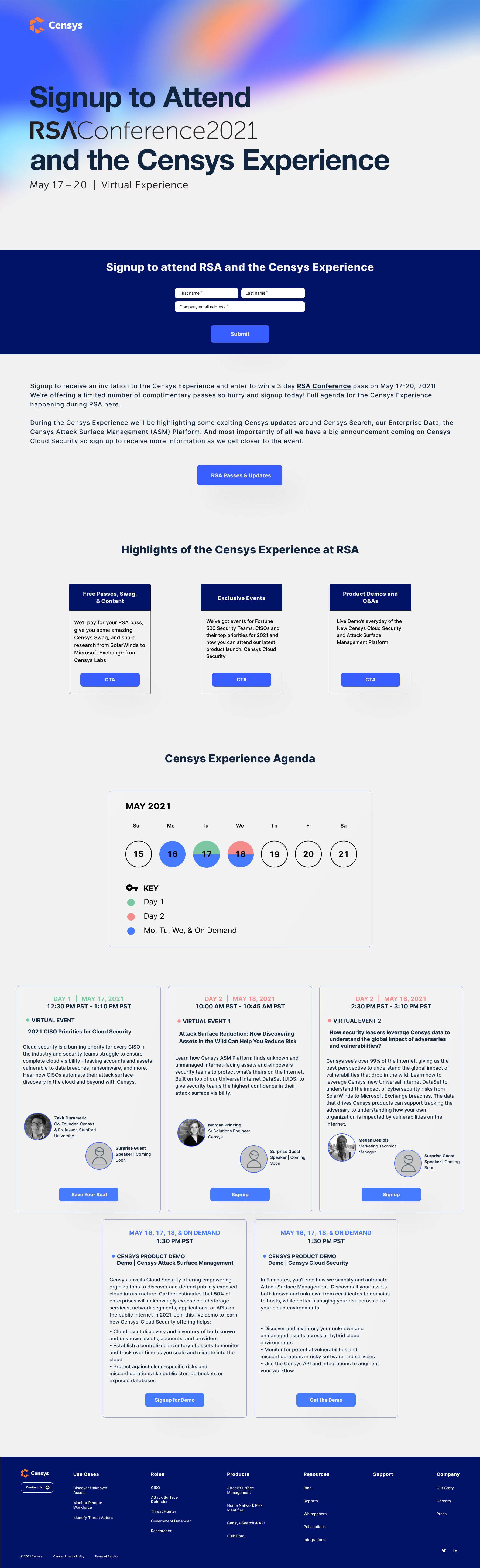
Description: Censys is an Attack Surface Management Platform based in Ann Arbor, Michigan. The company began as a research project at the University of Michigan by the creators of ZMap.
Homepage Redesign:
One of my primary responsibilities was leading the redesign of the company website. I collaborated closely with the VP of Marketing to develop a new layout that felt more modern and intuitive, while still preserving the core elements of the original brand identity.
Low-fidelity wireframe:
Prior to redesign:
After redesign:
Representative page from the redesigned site
(use cases page):
RSA Landing Page:
Role: Visual & UX Designer (Contract)
Date: 2021-2022
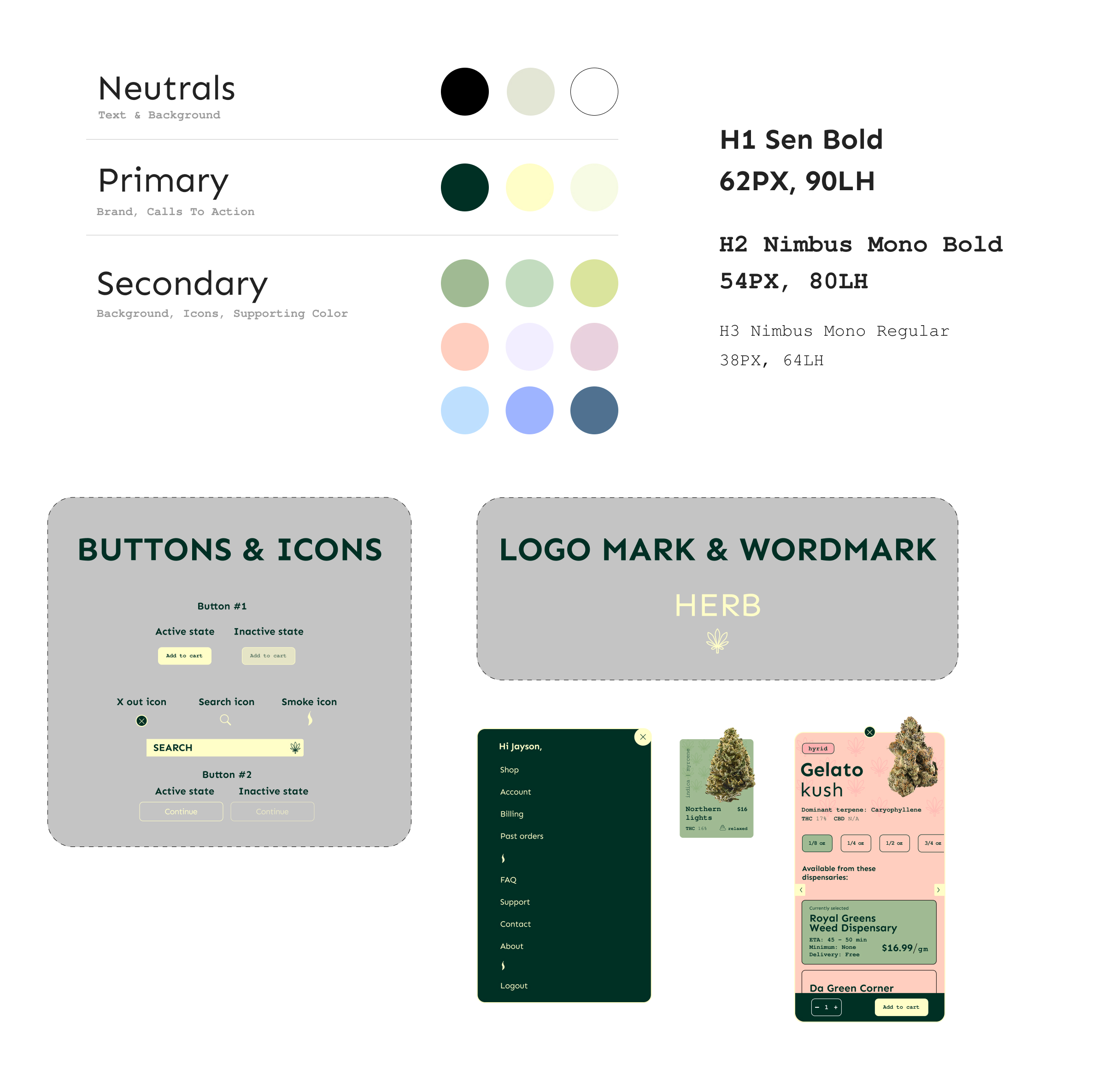
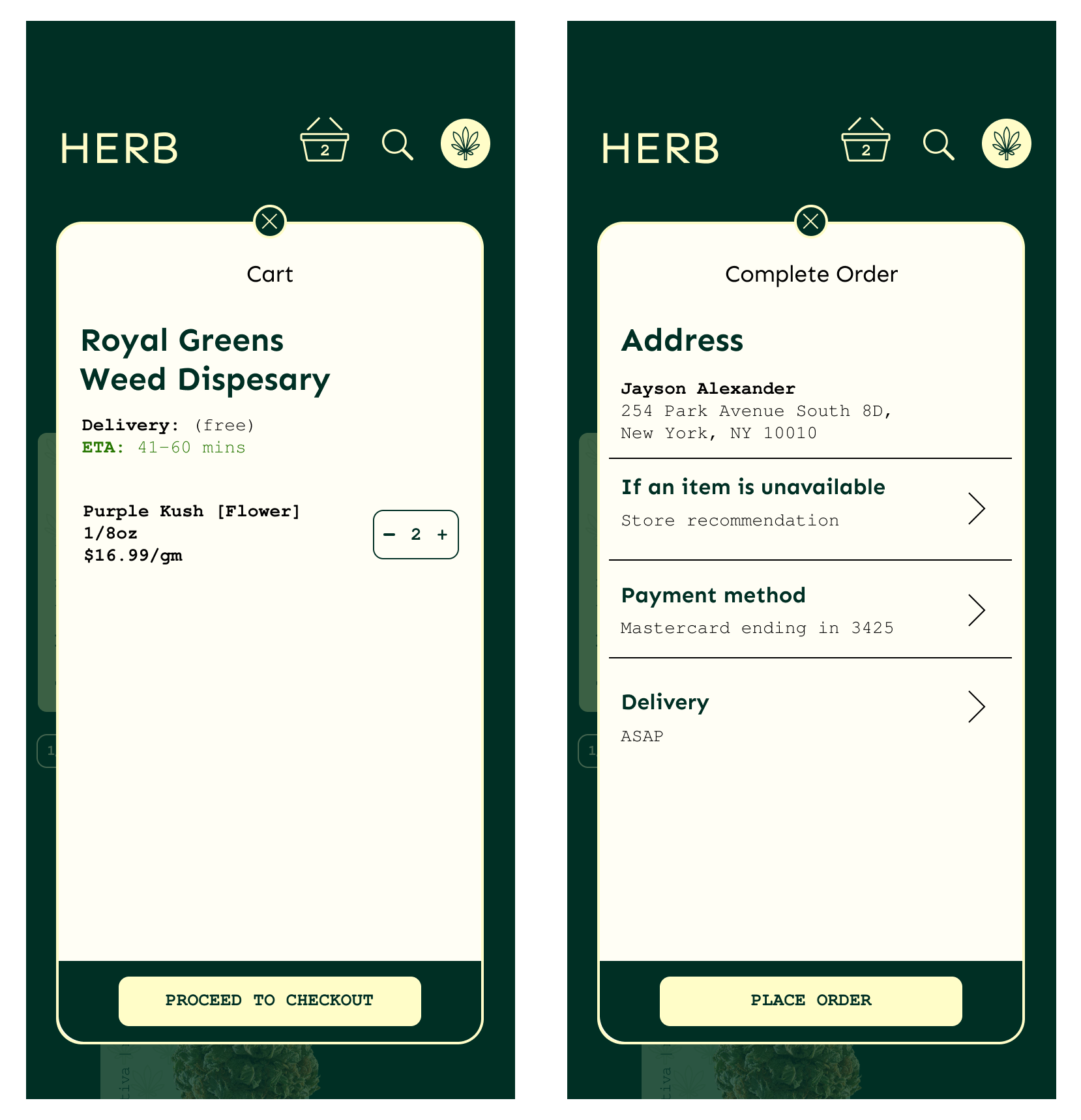
Description: Herb is an iOS cannabis delivery app designed around ease and clarity. The experience centers on seamless product discovery and a frictionless checkout flow, supported by a refined visual system that makes browsing and ordering feel effortless.
App Prototyping
As a contract designer, I developed the design prototype for a cannabis delivery app focused on a seamless and intuitive user experience. I worked across the full product flow, from browsing and product discovery to checkout, creating a clear and cohesive interface that balanced usability with a modern, elevated visual identity.
Design System:
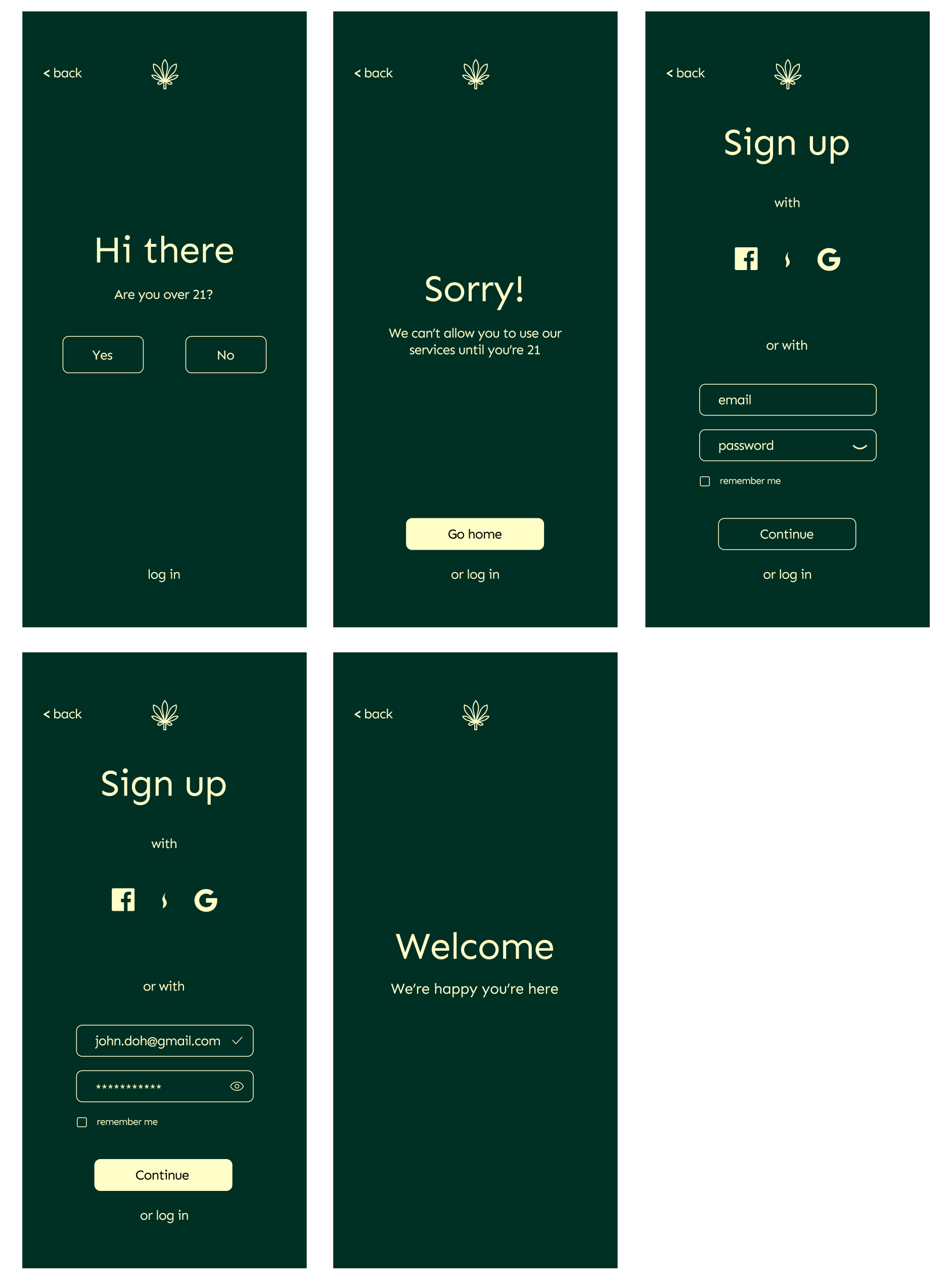
Sign Up Flow:
This sign-up flow is designed to feel seamless while meeting compliance requirements, beginning with a simple age verification step. Users can quickly create an account through Facebook or Google integrations, or opt for a straightforward email and password sign-up, with no credit card required upfront to reduce friction. To ensure full eligibility, valid ID verification is handled in a separate, dedicated flow after account creation. The experience prioritizes ease of entry while still incorporating the necessary safeguards.
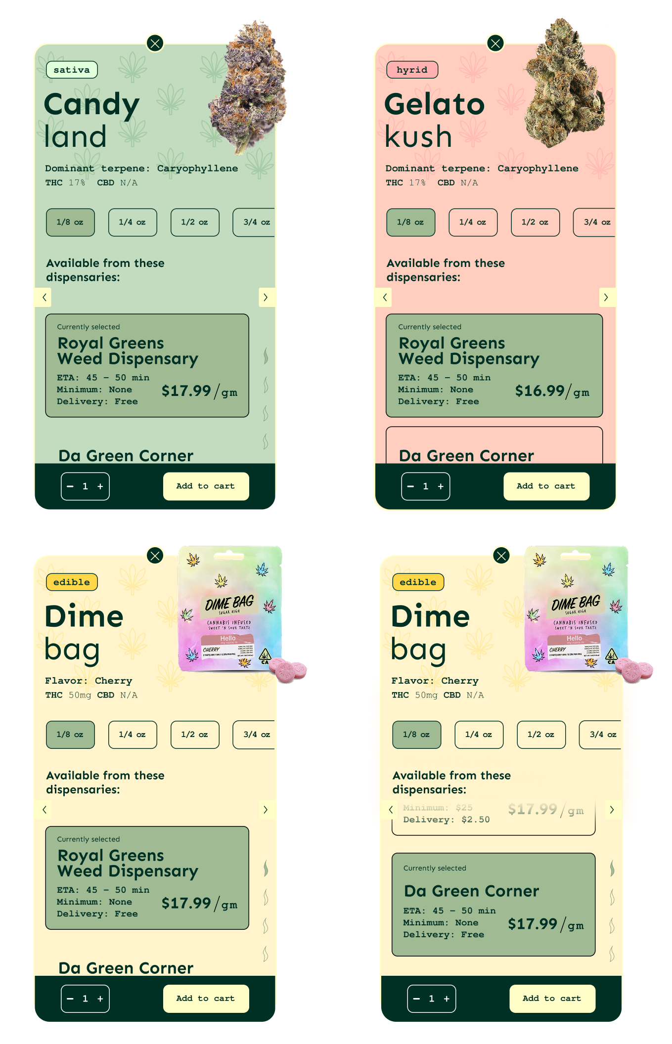
Navigation Design:
This navigation was designed to make category switching feel quick and effortless, with a horizontal scroll that keeps all product types within easy reach. A subtle active smoke-shaped indicator reinforces selection without interrupting the visual flow, helping users stay oriented as they browse. The result is a lightweight, responsive filter system that encourages exploration without adding friction.
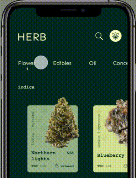
Card Designs:
These product cards were designed to make browsing feel quick, intuitive, and visually engaging, while still surfacing the details that matter most at a glance. Clear hierarchy and color-coded categories help users distinguish between strain types and formats, while modular components like sizing, pricing, and dispensary selection keep the experience flexible and easy to scan. The result is a streamlined path from discovery to cart, optimized for both clarity and conversion.
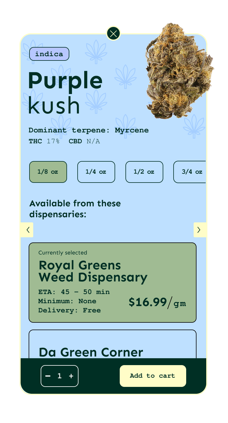
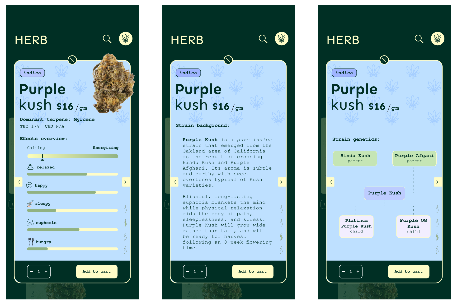
Detailed card state:
This expanded product view builds on the core card by layering in deeper education without overwhelming the user. Progressive disclosure lets shoppers explore effects, strain background, and genetics in a structured, swipeable flow, supporting both quick decisions and more intentional browsing. The design balances rich information with clarity, keeping key actions like quantity and add to cart consistently accessible.
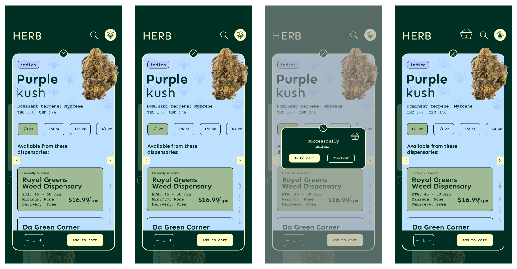
Add to Cart Flow:
The add to cart flow was designed to be quick, clear, and minimally disruptive to the browsing experience. Instead of redirecting users to a new page, a confirmation modal appears in place, allowing them to immediately understand that their action was successful. From there, users are given clear next steps, either continuing to browse or proceeding to checkout, reducing friction and maintaining momentum.
This cannabis delivery app was designed to create a seamless, low-friction onboarding and shopping experience within a highly regulated space. The flow prioritizes clarity and ease, guiding users through age verification, account creation, and product exploration with a clean, minimal interface.
Social sign-in options and a simple email and password entry reduce initial barriers, while required compliance steps such as ID verification are intentionally separated into a secondary flow to avoid disrupting momentum. The result is a considered experience that balances usability with regulatory constraints.
Role: Visual/UX Designer & Front-End Web Designer (Freelance)
Date: 2019-2020
Description: The Pointe is Hilton Hotel's new development in Nassau, The Bahamas. For this project, I was hired to create a brand identity as well as a functional site.
The site was coded by hand, no templates were used.
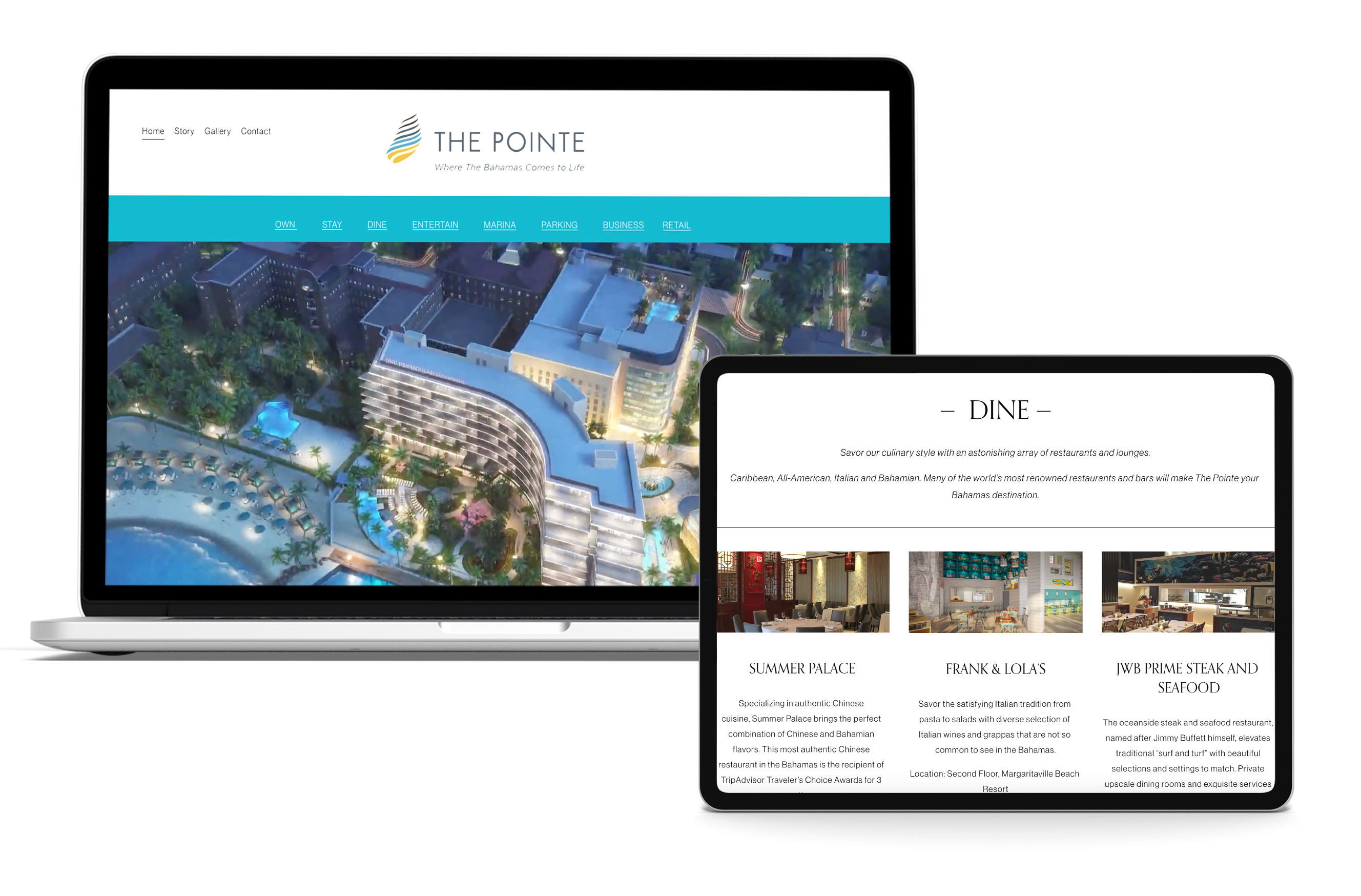
Hilton’s newest development in the Bahamas partnered with Margaritaville to create The Pointe, a mixed-use destination in Nassau featuring restaurants, a water park, and nightlife. I led front-end development and contributed to the brand direction, proposing a conch shell motif deconstructed into layers to mirror the structure and composition of the development.

The interface prioritizes clarity and ease of navigation, organizing 13 sections into a two-tier system to reduce overwhelm and improve usability.
I partnered with the motion graphics director to develop a hero video in Adobe After Effects, featuring renderings of the hotel and residential development.
The client informed me that the 2 buildings were developed to represent a layered shell. I presented them with a few initial sketches and followed feedback in order to create the final design.
Early logo designs:
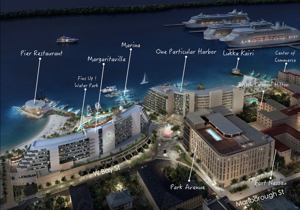
After the final direction was established, I developed the site’s color system and expanded the visual language. I also worked with a set of architectural renderings, refining and compositing them into a map-style visualization that labeled each building within the development.
Map rendering:
Artist rendering:
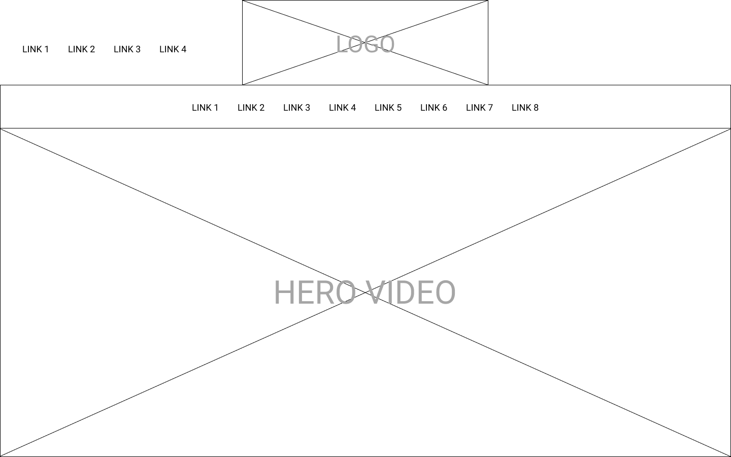
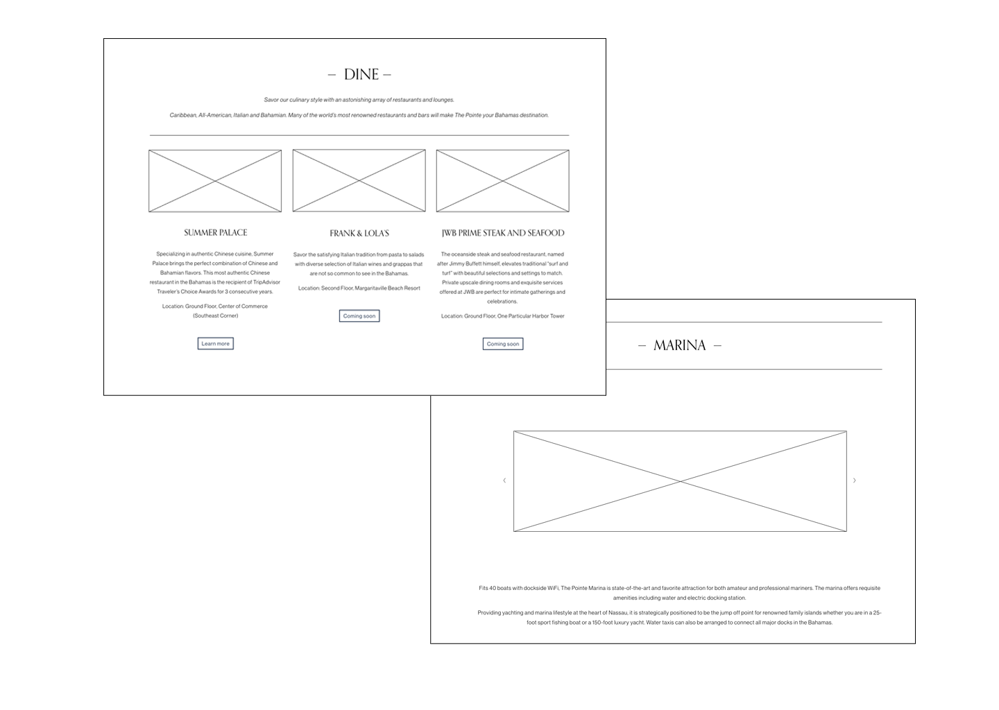
Low-fidelity wireframe
The final site was finished in 10 months from conception to execution.
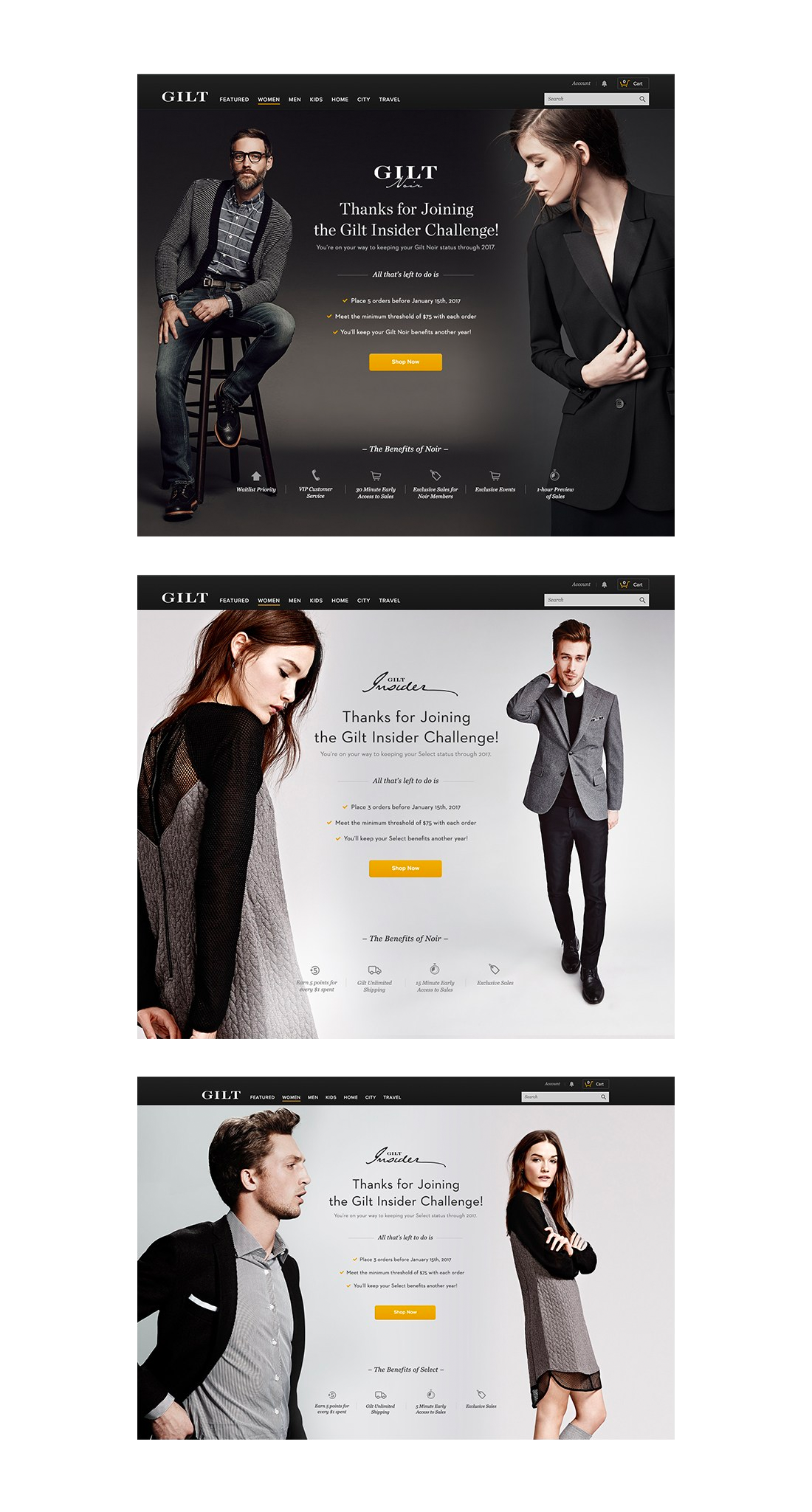
Role: Graphic Designer
Date: 2017-2019
Description: At Gilt, I worked closely with the creative director to create promotional materials that included HTML5 banners, HTML emails, and helped further the brand. I also worked on front-end development on the site as well.
HTML Email Promotion
Role: UX Designer (Contract)
Date: 2020
Description: 15 Seconds of Fame began as a social platform and evolved to support new forms of connection during the pandemic. In collaboration with the head UX designer, I contributed to research and helped design features that enabled families to connect remotely, while also supporting a program that integrates sports with charitable initiatives.
Final Responsive Site:
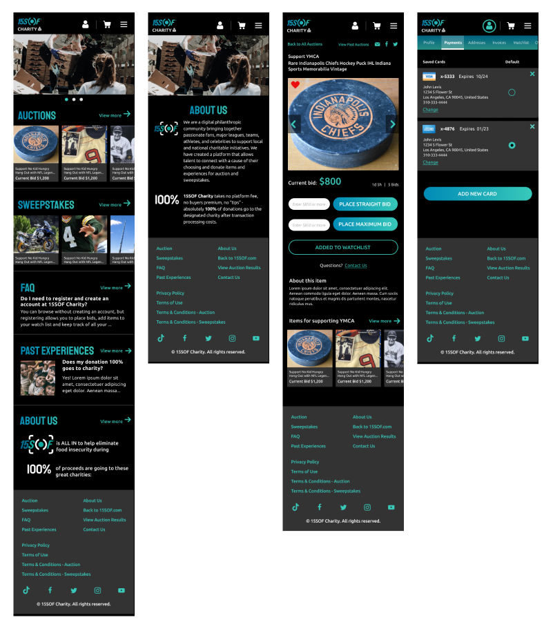
Audience from Anywhere (AFA)
AFA is a platform that enables shared viewing experiences, allowing users to watch live events together while participating in broadcast segments. I led the UX design, defining the end-to-end flow from onboarding through real-time interaction.
To prototype the system, I developed a mock wedding scenario where users could join as guests, create profiles, and engage with the event. Hosts could manage participation by enabling live audio, messaging, and reactions, or muting the audience as needed.
Select Wireframes for Host Flow:
Role: UX & Graphic Designer
Date: 2020
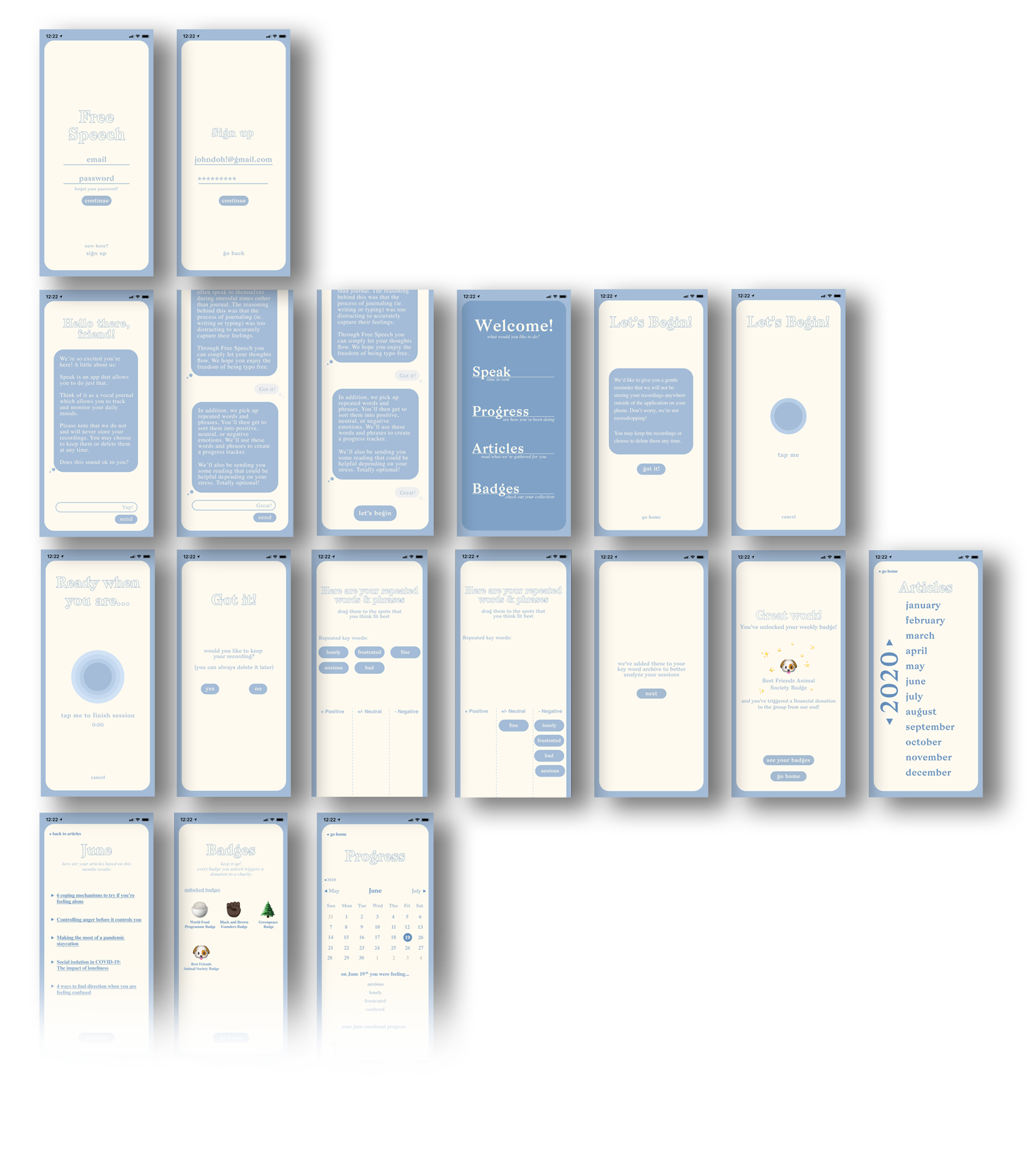
Description: An app that was prototyped with the goal of offering the user an outlet for daily stress.
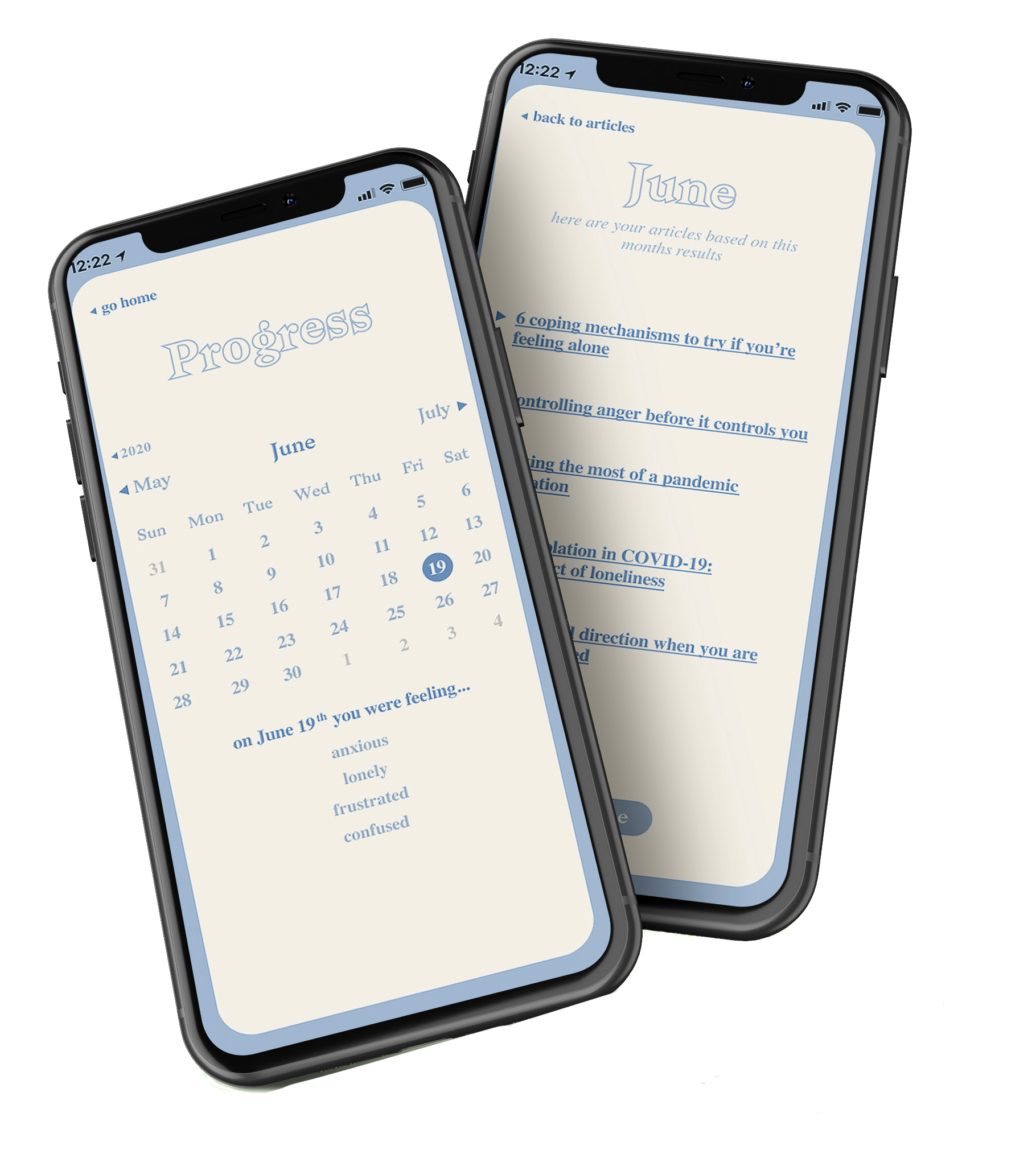
Free Speech was created in response to the isolation of COVID-19, with the goal of providing an accessible outlet for emotional release. I conducted a mental health study to understand how individuals were coping during this time.
Research revealed that many participants relied on internal dialogue when experiencing stress or loneliness. This insight informed a key question: how can we design a system that allows people to vent in a way that feels both intuitive and meaningful?

Research revealed that participants primarily relied on journaling or therapy to manage stress. While therapy was considered highly effective, it remained inaccessible for many due to cost. Journaling, although widely used, was often described as effortful and difficult to sustain during periods of heightened emotional distress.
A recurring insight was the interruption of thought flow. Participants noted that writing or typing required them to consider grammar and structure, which disrupted their ability to express themselves naturally. This highlighted an opportunity to design a more fluid and immediate form of emotional release.
User Persona:
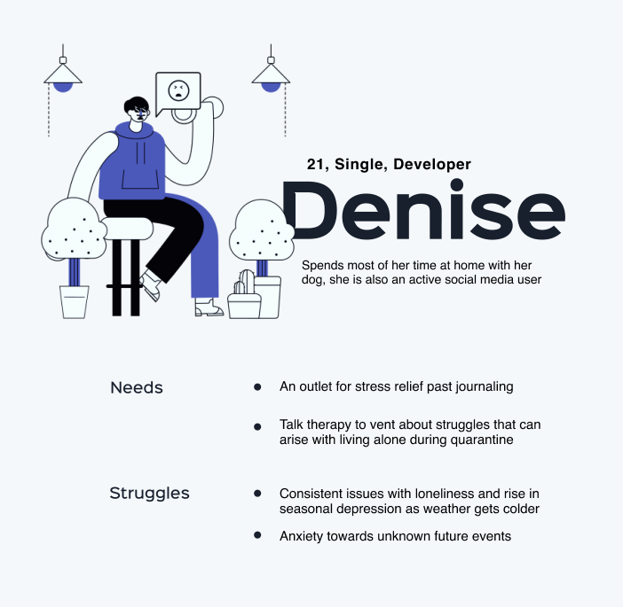
To better understand user needs, I created a persona, Denise—a 21-year-old developer living alone. Her previously social lifestyle shifted during COVID-19, where prolonged isolation began to impact her mental well-being.
She requires a way to process and articulate her thoughts with clarity. Free Speech supports this by enabling open, unfiltered expression while identifying patterns that may indicate emotional strain or areas for reflection.
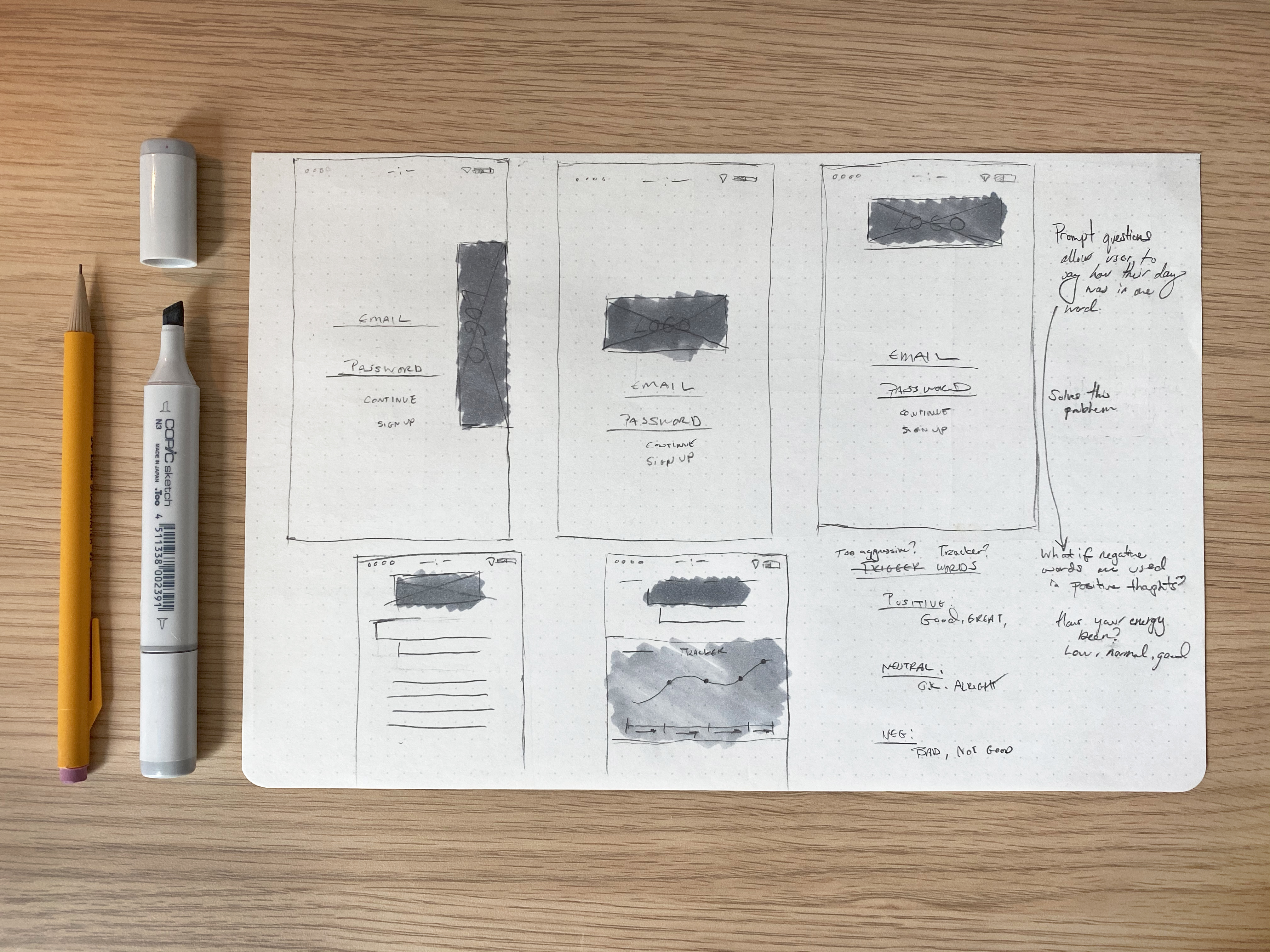
early wireframe sketches
While designing and prototyping Free Speech, the main goal was to allow the user to effectively vent. I wanted to keep the interface clean and approachable to encourage daily use.
The experience was designed to preserve uninterrupted thought flow while offering moments for reflection. To support this, the system uses machine learning to surface recurring words and phrases, allowing users to categorize them across emotional states. Over time, this builds a personalized model of language and sentiment, generating insights that users can revisit to track progress.
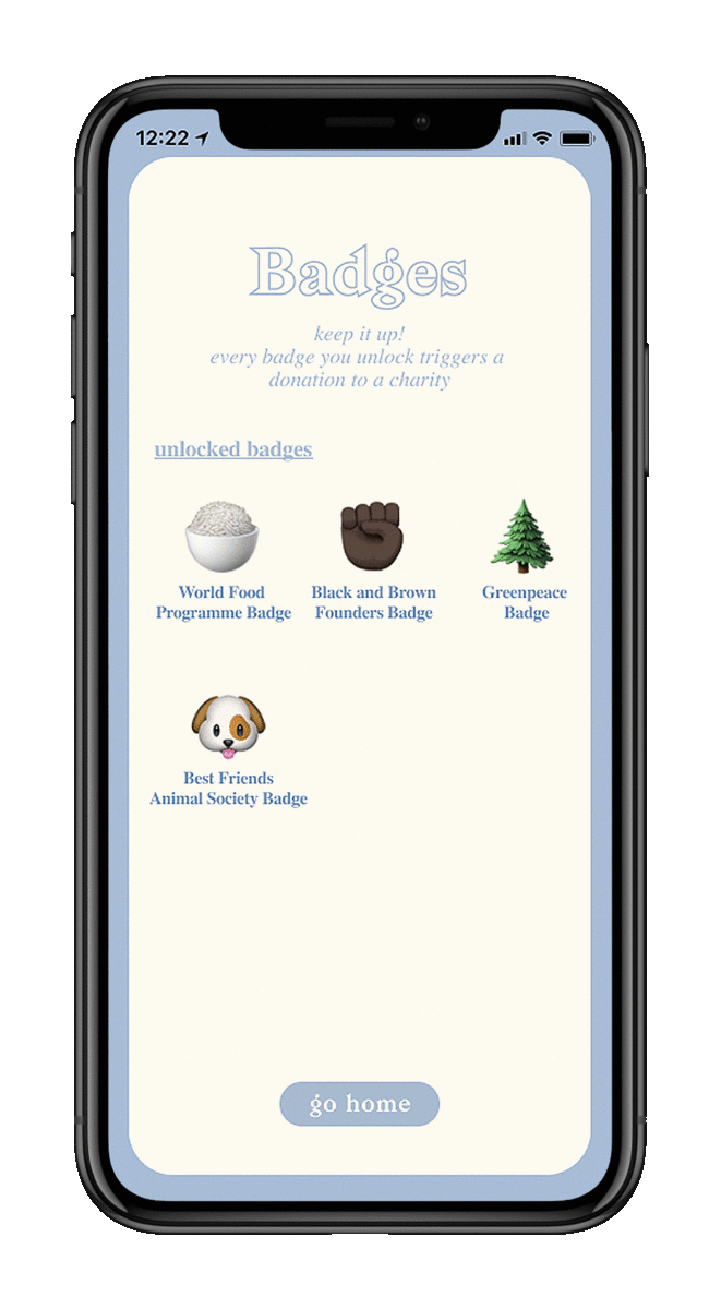
To drive consistent engagement, I introduced a badge-based incentive system tied to charitable giving. Users unlock badges through regular use, with each milestone triggering a donation to a partnered organization.
Low-fidelity wireframe:
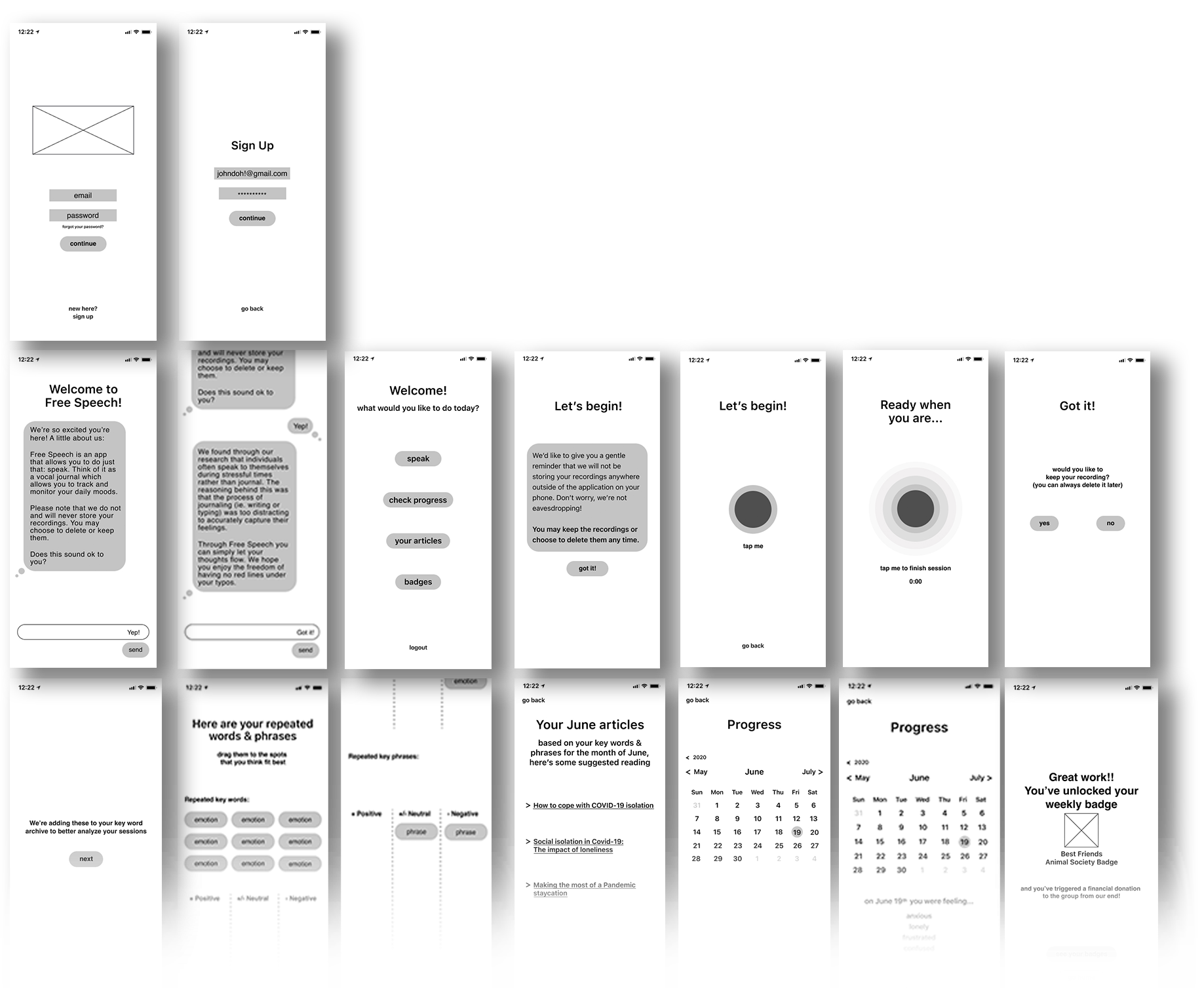
High-fidelity wireframe:
Role: Visual Designer & Front-End Web Developer (Freelance)
Date: 2020
Description: Graycliff Skybar is a rooftop bar at The Pointe in Nassau, The Bahamas, created in partnership with the Graycliff hospitality group. With panoramic ocean views, the space brings a refined coastal sensibility to the brand.
I designed the UI for the website, translating the brand into a cohesive digital experience.
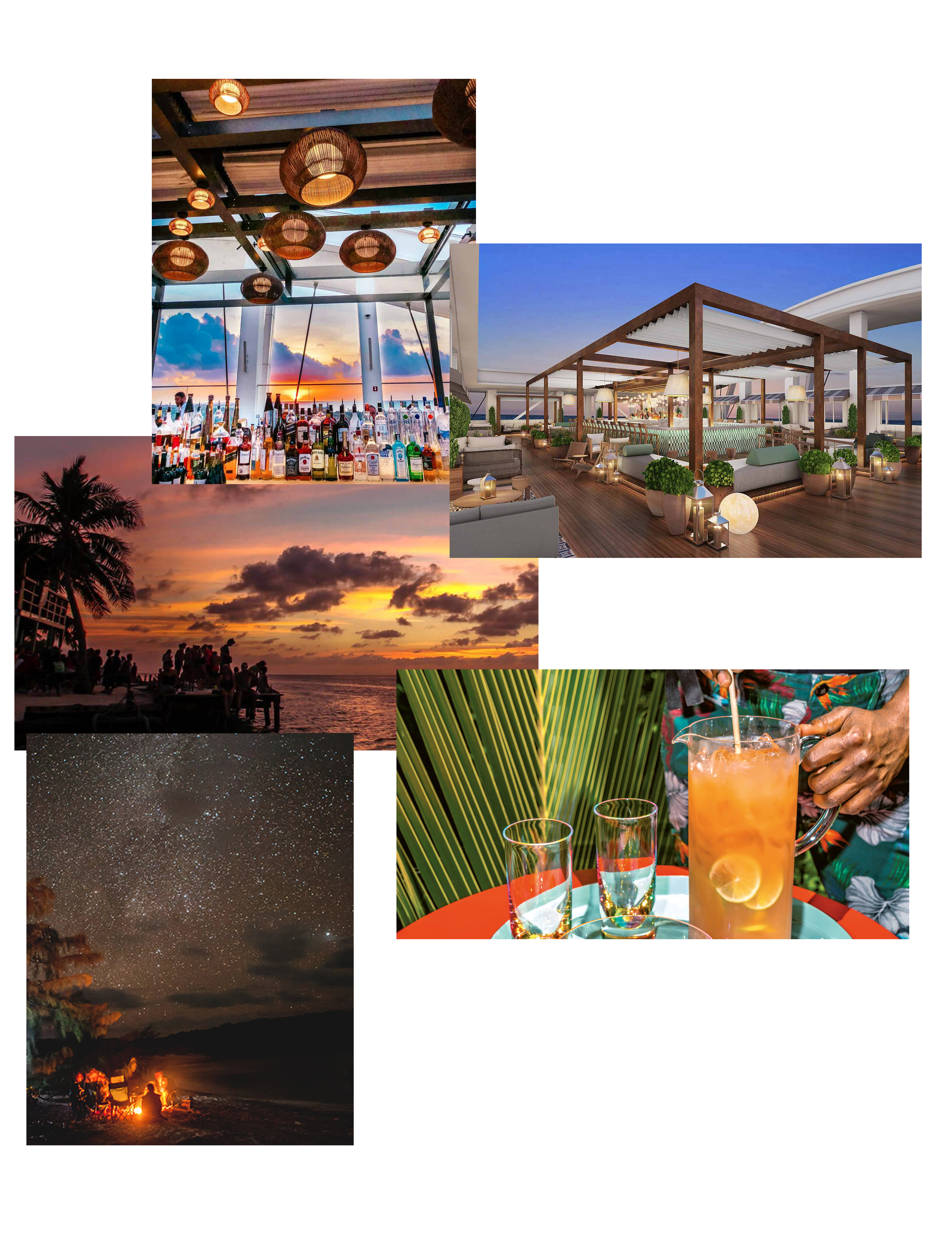
The concept focused on creating a fluid, chic experience that captured the spirit of the Bahamas through bold imagery and minimal text. The copy translated naturally into large typographic moments, shaping a parallax-driven layout with full-width visuals and layered content.
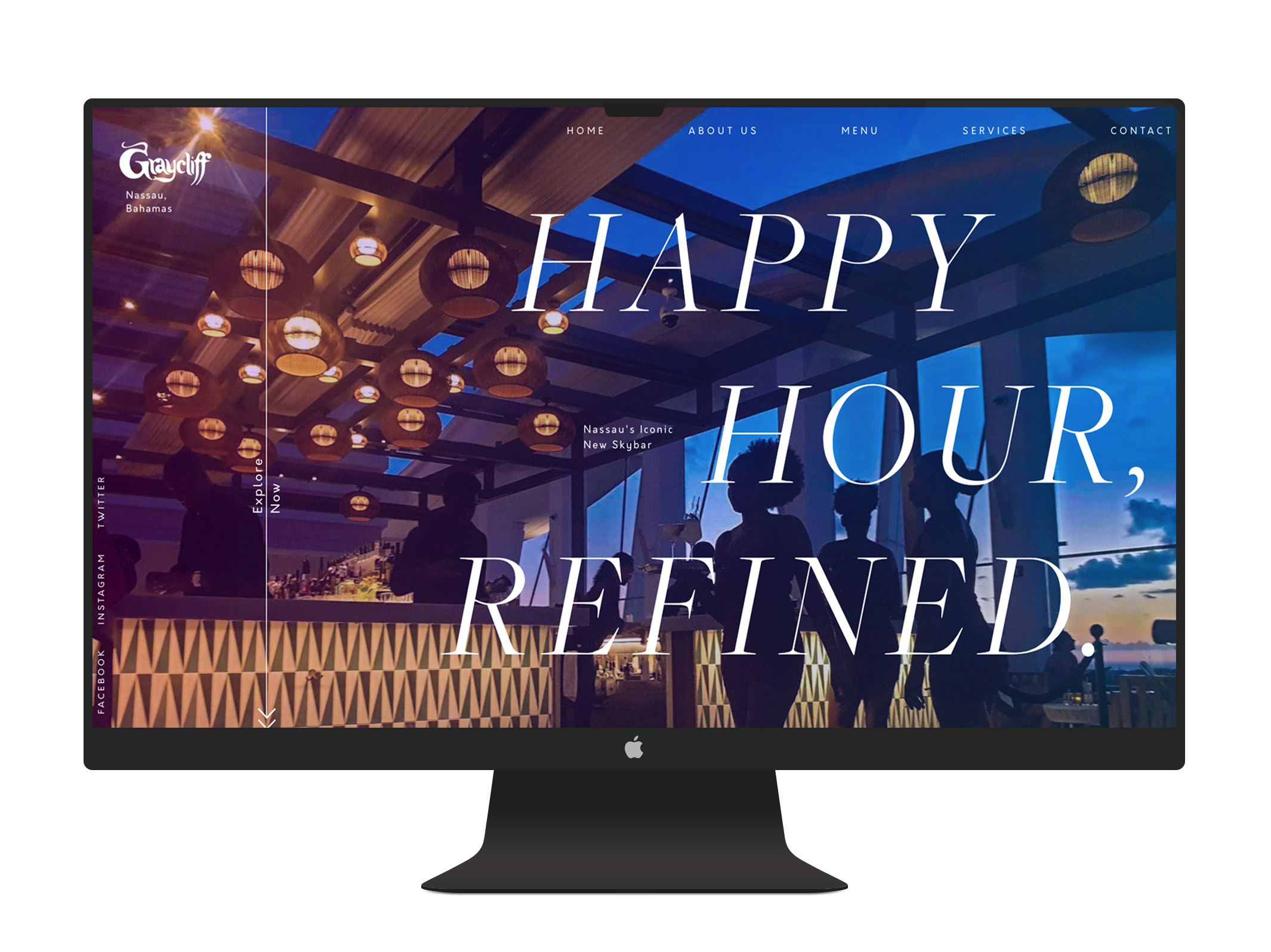
The logo itself is iconic so we opted to keep the majority as is in the site. In order to help the logo fit in better with the site, the stars and lower text bubble that were initally above the "Graycliff" text were removed to keep consistency in the typography.

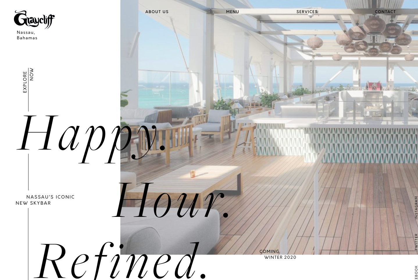
initial high-fidelity wireframe (not approved / sent back for revisions)
With a strong focus on color, I used a background gradient to anchor the palette and create visual continuity. Image opacities were adjusted to soften contrast and bring greater cohesion to the overall composition.
To guide users through the page, I introduced subtle motion cues, including an animated line with directional arrows and progressive text reveals. These elements helped reinforce flow and added a layer of interactivity without overwhelming the experience.

Given the emphasis on minimal copy, I designed a parallax-driven layout with full-width sections to create a more immersive, image-led experience while preserving a clear sense of progression.

The final site features large-scale imagery with overlaid typography and subtle motion. Rather than relying on dense content, the experience emphasizes atmosphere, allowing the visuals to convey the spirit of the Bahamas. A background gradient anchors the palette, capturing the warmth of a setting sun.
Role: Visual Designer & Creative Director
Date: 2018
Description: Layout design and branding for lifestyle, art, and fashion print publication, Soft Mag.
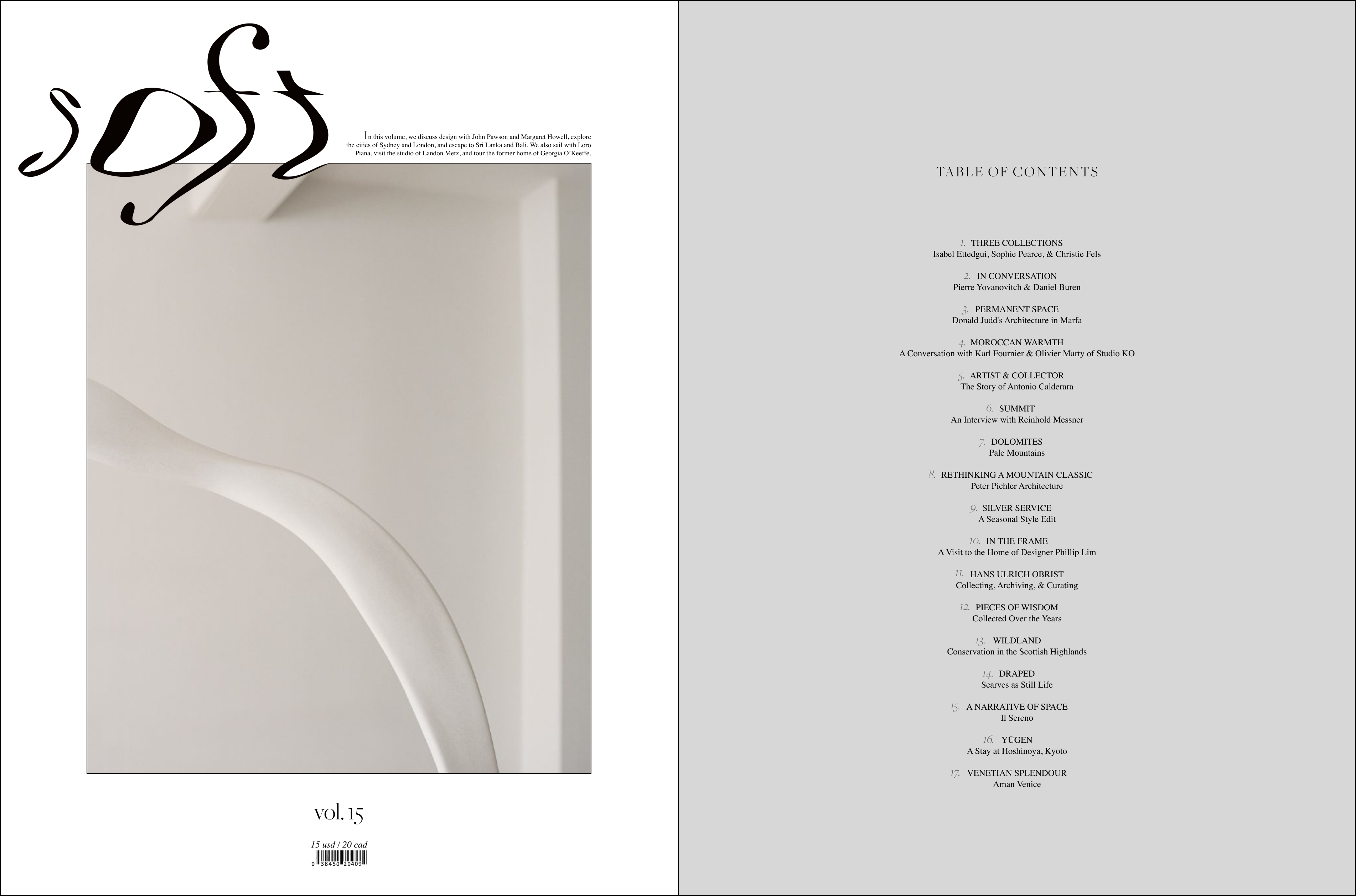
cover design & ToC for Vol.15 of Soft Mag
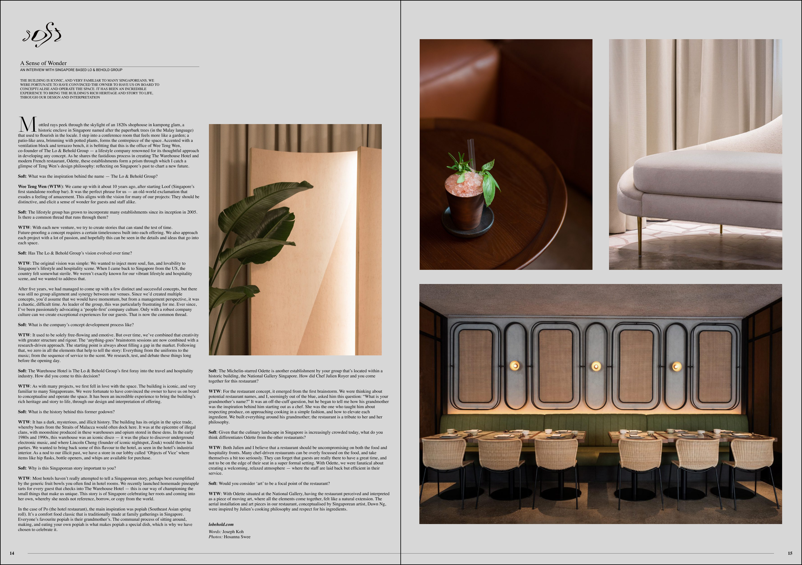
layout for Soft Mag's interview with a Singapore Restaurant
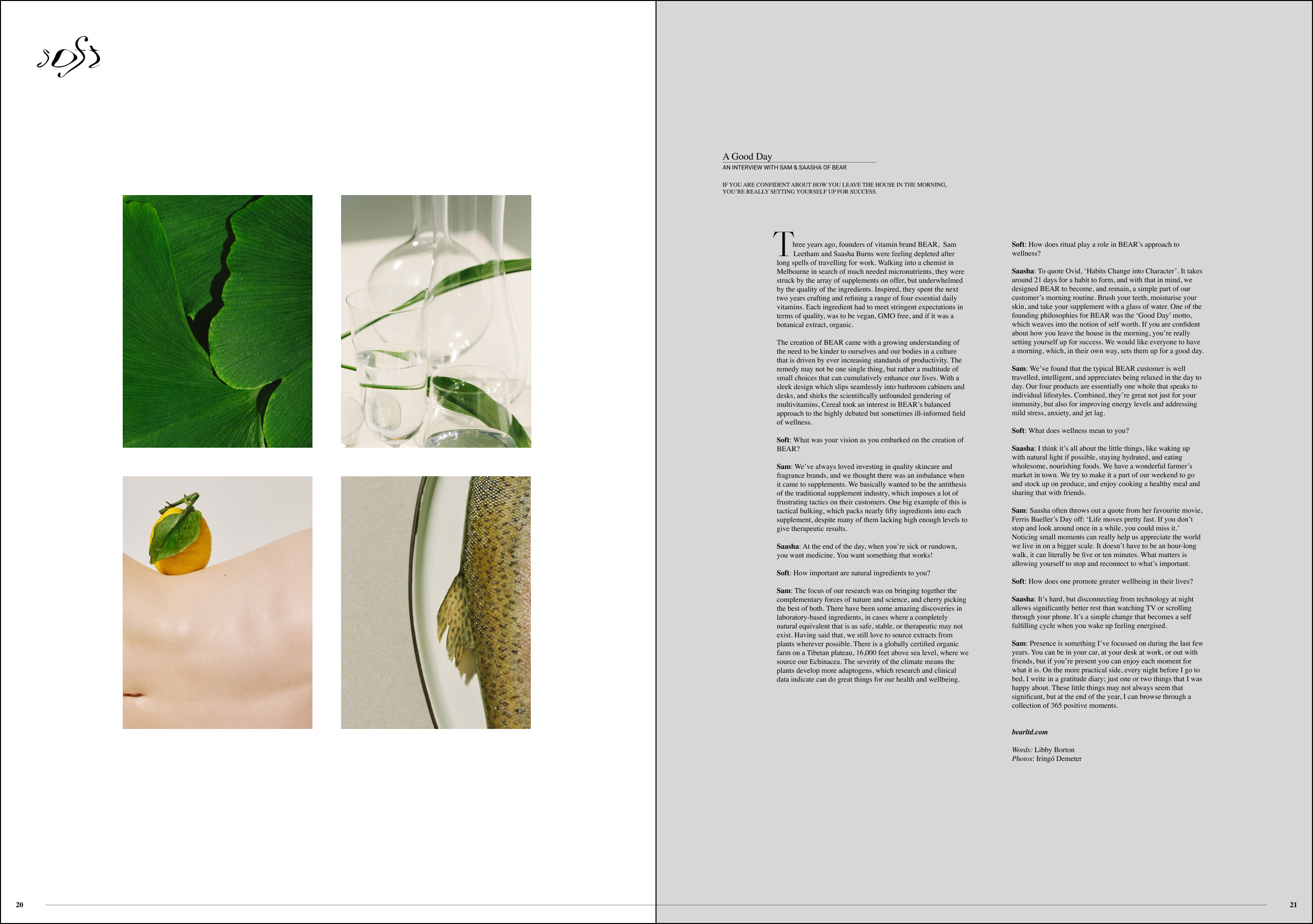
layout for Soft Mag's interview with BEAR
Role: Visual Designer
Date: Ongoing
Description: An ongoing collection of logo design, branding, & all other digital designs.
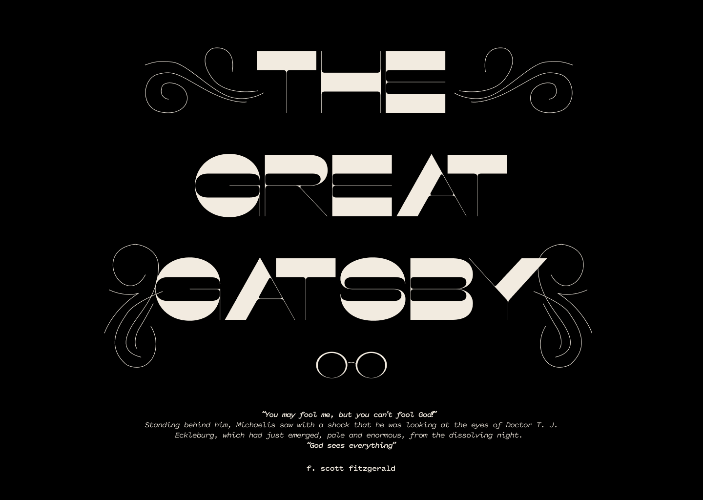
Great Gatsby Redesign
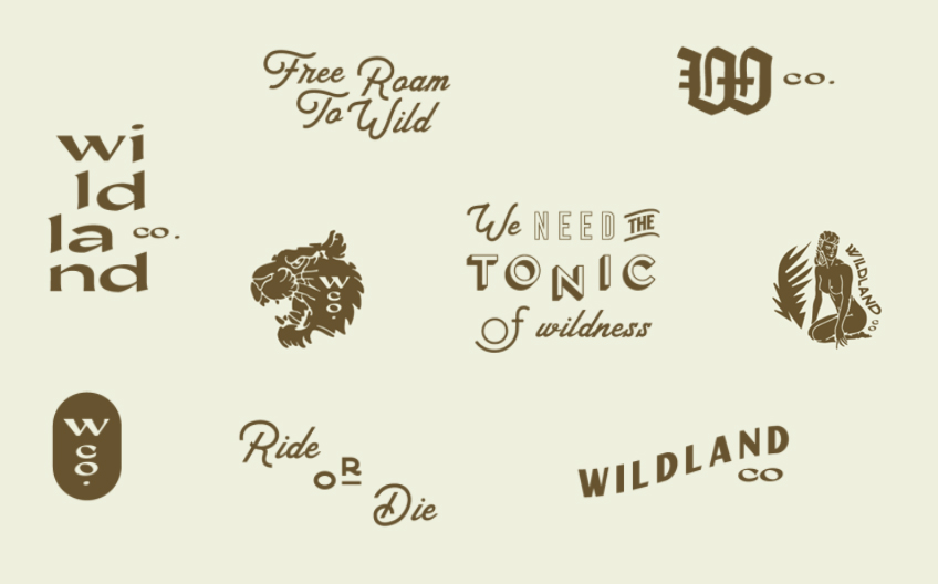
WD Logo Designs
Mock site for For the Home, visit her site here